MobileFirst-Personal Websites
Archives
MobileFirst-Personal Newsletter - Issue April 12, 2026

Subscribe
MobileFirst-Personal Websites
Archives
MobileFirst-Personal Newsletter - Issue April 12, 2026
Steve Pond
Apr 21, 2026
April 14, 2026 |
 |
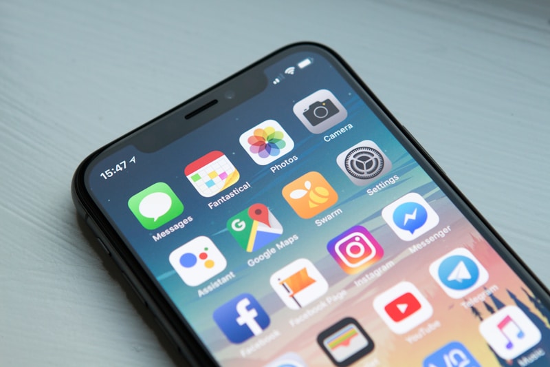
Mobile-first design prioritizes smartphone users from the start, creating better experiences across all devices while improving search rankings and conversion rates. Read More... |
Trivia Question❓What percentage of global web traffic now comes from mobile devices? A) 45% B) 58% C) 67% D) 72% Answer at the bottom of the newsletter |
 |
Learn why Progressive Web Apps are becoming the go-to solution for small businesses wanting to deliver premium mobile experiences without breaking the bank. Read More... |
Q/A Questions |
Q: What is the difference between mobile-first and responsive design?
A: This is a great question that confuses many people.
Responsive design means your website adapts to different screen sizes. It is like having one website that stretches and shrinks to fit whatever device is viewing it. The desktop version is built first, then code is added to make it work on mobile.
Mobile-first design flips this approach. You start by designing for the smallest screen first—the mobile phone. Then you add features and layout adjustments for larger screens.
The key difference is philosophy and priority. Mobile-first forces you to focus on what really matters. When you have limited screen space, you eliminate clutter. You prioritize content. You think about thumb-friendly navigation from day one.
With responsive design, mobile can feel like an afterthought. With mobile-first, it is the foundation. |
|
Discover why mobile-first design, speed optimization, and Progressive Web Apps are crucial for small business success in 2026. Read More... |
💡 Answer to Trivia Question: Answer: B) 58% Mobile devices now account for approximately 58% of all global web traffic, which is why mobile-first design is essential. |