MobileFirst-Personal Websites
Archives
MobileFirst-Personal Websites - April 26, 2026

Subscribe
MobileFirst-Personal Websites
Archives
MobileFirst-Personal Websites - April 26, 2026
Steve Pond
Apr 28, 2026
April 28, 2026 |
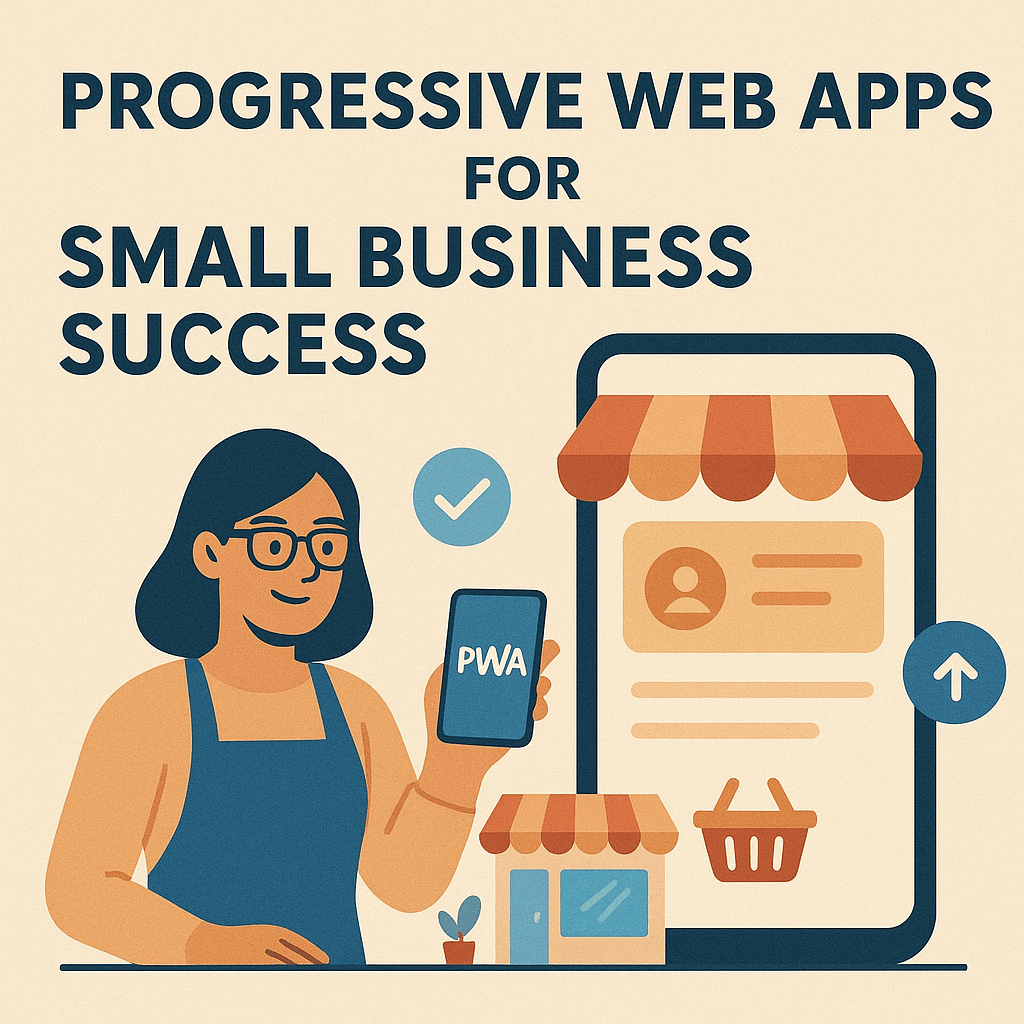 |
Progressive Web Apps (PWAs) are changing how small businesses connect with customers, providing a more affordable digital solution than traditional mobile apps.
PWAs run in web browsers, eliminating the need for costly downloads and sidestepping the 30% commissions that app stores often require.
Local businesses can quickly launch a PWA using easy-to-access development platforms, creating a custom mobile experience within minutes.
These apps also offer practical features like offline access and push notifications—once only possible with expensive native apps.
For example, a local restaurant can use a PWA for online ordering, letting customers browse menus and place orders—sometimes even without an internet connection. Consultants and shop owners can also use PWAs to schedule appointments or display products, making services more accessible and engaging.
With PWAs, small businesses gain more control over their customer relationships and reduce dependence on big tech platforms. Read More... |
Trivia Question❓In the world of web development, what is the term used to describe the design strategy where website functionality and user experience are prioritized for mobile devices before desktop computers? Answer at the bottom of the newsletter |
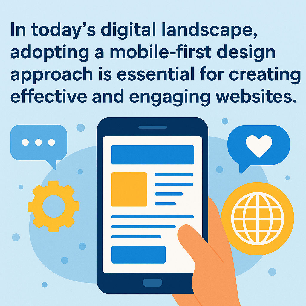 |
Mobile-first design has become essential for modern websites, placing smartphones and compact screens at the forefront of the creative process.
This method ensures that vital content and tools remain accessible for users on the go, resulting in faster load times and better, thumb-friendly navigation.
Unlike traditional responsive design, which often shrinks desktop sites for mobile use, mobile-first avoids clutter and confusion by starting small and scaling up.
Adaptive design creates several fixed layouts for different screens, but it can miss the mark for some devices and demand more resources.
With over 70% of health-related searches now happening on mobile devices, the shift in user habits is clear.
Google completed its move to mobile-first indexing in July 2024, prioritizing mobile-optimized sites in search results.
Platforms like MobileFirst showcase the effectiveness of designing for phones first, helping businesses reach users wherever they are. Read More... |
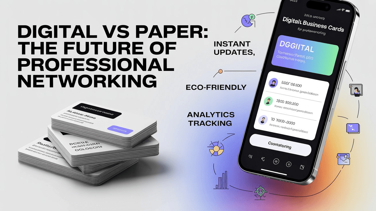 |
More professionals are making the switch to digital business cards, driven by a desire for efficiency and sustainability in today’s fast-paced world.
The environmental benefits are substantial. Billions of paper business cards end up as waste each year, escalating deforestation and landfill impact.
By going digital, individuals reduce their carbon footprint and promote eco-friendly networking.
Digital cards offer dynamic features: instant updates, personalized links like yourname.mobileintros.com, and sleek brand presentation that build professional credibility.
They also include one-tap contact saving, integrated calendars, portfolio displays, and analytics, making follow-ups smarter and networking seamless.
The cost savings are undeniable—maintaining a digital card annually is often far less expensive than printing hundreds of paper versions.
Industries from tech to real estate, especially in cities such as San Francisco and Miami, are leading the charge in adopting these innovative tools for smarter, more sustainable connections. Read More... |
Quote Of The Day |
"Good design is making something intelligible and memorable. Great design is making something memorable and meaningful." - Dieter Rams |
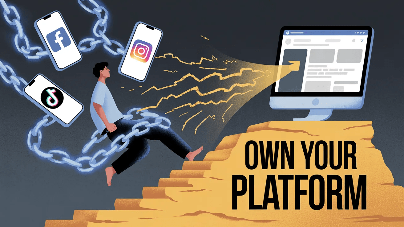 |
Relying solely on social media platforms like Facebook, Instagram, or TikTok is risky, much like building on rented land.
Frequent, unannounced algorithm changes can sharply diminish how many people see your content.
Instagram’s December 2025 update, granting users more control over Reels algorithms, underscored the power these platforms hold over creators.
Sudden account bans, often due to AI moderation errors, can instantly cut off businesses from their communities.
Data privacy also remains a concern, especially as platforms like TikTok face scrutiny for their data practices.
With organic reach declining, creators are increasingly forced to pay just to reach their own followers.
Owning a website or mobile-first platform puts you in charge—of your message, relationships, and brand reputation.
This independence protects your business against sudden disruptions and strengthens your credibility and connections. Read More... |
Secret Little Hack |
Reduce image file sizes by using compression tools like TinyPNG or ImageOptim to improve loading speeds on mobile devices. |
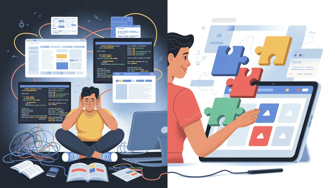 |
Picture building a sleek, professional website in just 30 minutes—no tech experience needed.
Modern website builder platforms make this possible for everyone.
Consider Alex, a local artisan who brought her handcrafted creations online.
She bypassed confusing coding by choosing an easy drag-and-drop builder with customizable templates that fit her brand perfectly.
With a few clicks, Alex added vibrant product images and inviting descriptions, all while integrating e-commerce and booking features—without touching a line of code.
Setting up a custom domain and going live took minutes, not days.
Her website boasts over 40 built-in widgets, from galleries and forms to secure payment processing.
Thanks to platforms like Wix and Squarespace, mobile-first design and user-friendly tools let anyone shine online.
Now, every entrepreneur can transform an idea into a standout web presence—quickly, affordably, and beautifully. Read More... |
💡 Answer to Trivia Question: Mobile First Websites |