MobileFirst-Personal Websites
Archives
MobileFirst-Personal Websites - January 6, 2025

Subscribe
MobileFirst-Personal Websites
Archives
MobileFirst-Personal Websites - January 6, 2025
Steve Pond
Jan 6, 2026
January 6, 2026 |
 |
Welcome to the new year - Time for a new Point of View |
I love the internet!
Not all the junk. The endless sales pitches for how to succeed on it or the huge amount of junk you can find on the digital highway. Let the oily salesmen and the greedy hucksters continue to push their shit to the hungry readers of the digital cafe endlessly.
Most of that occurs as a result of the overpowering of social maturity by the social media giants Facebook, Instagram TikTok and whatever. They tell us what we should be thinking, they control the algorythms that post to the members and they simply strain all the personal data they can from each individual to be sure they are behaving the way they want you to.
The internet is still available to people who want to use it the way it was intended. This has not been possible for the last few years since building an independent website has been held captive by traditional website editors. They develop a website for the desktop monitor and have only grudgingly moved to responsive themes that often cost more, then place their idea of mobile design onto a mobile phone however they decide. There is little, if any, ability to customize their sites to the mobile user, who happens to be the biggest internet bowser presently.
The traditional website editor has had hegemony for quite a number of years. It has gradually eliminated the people who have good ideas to offer their peers. The cost is so high to support a website on a monthly basis, few are able to express independent ideas from an affordable platform.
A few years ago, the hegemony of the desktop website was shattered when Google opted to define the guiderails for mobile first websites. These set a different set of parameters to rank all websites that are returned to the browser search. Traditional websites are being degraded and punished in their placements because they are not responsive to the need for much faster and less dense uploads to the phone device screen.
Social Media has overwhelmed the natural instinct to provide a useful information site by forcing people to post for likes and comments, not promote the inherent expertise they have in various subjects. The advent of mobile first websites, and especially the MobileFirst-Personal websites platform has reset the traditional website creation process by adding an adaptive website editor that is easy to use. This editor adapts to any device as long as there is a connected chrome browser. We have dropped the cost of owning your own internet presence to a single monthly cost that can be as low as 2.00 a month for a pair of digital business cards (24.00 per year annual charge).
The present scheme of social media as a transfer of information on the internet is geared toward short video bytes of minimal information. This standard has the possibility of losing a lot of the hard won expertise long term hobbyists in any niche have gained over time and with experience.
These are the people who should be building websites to transfer their passions and expertise to travelers of the digital highway so it is never lost over time.
To most, the complexity of traditional website builders is way too exoteric for them to understand or afford. MobileFirst-Personal websites offers ALL of the power of any of the traditional web builders on a platform where they can easily understand how to create and maintain their own website. All for a single monthly charge never exceeding 30/month even on our most expensive plan. The Influencer plan offers 20 blank websites.
Most people will be able to build any style of website they like for 10 a month - no added fees! If they sell products using our e-commerce system that rivals fully optioned Shopify, there are no commissons taken by the platform. All sales are yours, with no "optional" plugins needed to make the site work correctly. |
Building a strong online presence has become essential for entrepreneurs and small businesses in today’s digital age.
MobileFirst-Personal helps solopreneurs and SMBs create branded websites with a complete e-commerce system—no expensive extras required.
Users can sell courses easily by using the integrated academy module, and sites can even function as Progressive Web Apps when paired with a personal domain and MobileFirst SSL certificate.
Meanwhile, MobileIntros.ca is perfect for professionals who want a simple digital presence without the hassle of domain management.
The platform specializes in digital business cards, offering stylish templates and immediate home screen access to boost client engagement.
Both platforms take a mobile-first approach, delivering fast performance, offline access, and push notifications for seamless user experiences.
These solutions empower businesses and individuals to craft online experiences tailored to their unique needs. Read More... |
What is the difference between the Mobilefirst-Personal websites and the Mobileintros.ca platforms? |
To be honest, the interface for all the MobileFirst platforms is essentially identical. The user interfaced is the exact same and the adaptive power of the website editor to be able to be used wherever the chrome browser is connected is identical as well.
The difference between the two major platforms is what your intentions may be with the way the website is designed and how the resulting PWA mobile Applications are deployed.
MobileFirst-Personal and MobileFirstCanada Websites
MobileFirst-Personal Websites was implemented first. It was envisioned and designed for solopreneurs and small to medium businesses that have more time than money in their budget for internet related projects but still want establish their own brand and digital awareness in their customers. The PWA is solely their responsibility as they must provide the domain it is deployed on.
The underlying platform was built to extend the power of a complete e-commerce support platform to the little guy. It provides a full and complete store building system without requiring expensive add-ons to perform specific jobs, such as product upload, analytics or special display and sales systems. Unlike most of the present traditional store builders which use plugins and add-ons as a way to increase their monthly charges to often ludicrous degrees, all those services are already integrated. In addition, the MobileFirst-Personal and MobileIntros platforms do not charge any commissions on your sales, what you sell you keep
Mobilefirst-Personal is steeped in that powerful e-commerce system, but then adds to it the ability to create courses as well. Coaches, experienced hobbyists and other experts can deliver their hard won expertise in an easy to build course setting. Once complete, you can sell the results to others that need their knowledge. Often the Academy module is used to develop the training materials required for the actual products or services provided by the website itself. In this case, there is no requirement to move to some external builder to complete the educational needs of the website as a whole.
MobileIntros.ca Websites
MobileIntros.ca as a site platform has grown out fo the huge requirement for individuals to develop their own website persona, but don't want to mess with the intricacies of creating PWA as separate branded entities. Not everyone actually requires their own vanity or brand domain to develop their brand.
Networkers, many individual solopreneurs and other independent individuals are most interested in providing a solution for a closer circle of clients and customers with their products , information or services. They are not interested in going through the hassle and extra expenses of buying a personal domain and configuring the DNS to customize the site. They are much happier with using a structured URL that is automatically provided by the MobileIntros site; such as [YourName].mobileintros.ca. It becomes their own personal URL and is an integral part of the website structure automatically.
MobileIntros is a site platform with a large number of templates for creating digital business cards for almost any individual, solopreneurs or small business requirements. That is the main focus of the platform. Although full service websites can be made, mostly they must be made from scratch. The power of the site is that it is already built with a SSL and Domain structure that automatically turns the website into a PWA that can be placed on the home screen of the clients' phones and has all the power of native mobile applications without requiring any registration or acceptance by the native app stores.
Transformation of a mobileFirst-Personal website into a PWA is not as straightforward since the Webmaster must acquire a perosnal domain and purchase a MobileFirst SSL to be able to trans form the websoite into a PWa with all the powers that provides. It is often l;ess that 25.00 to perosnally brand the website as a PWA, so the costs are still minimal.
MobileFirst-Personal Websites are mainly standard websites MobileIntros Sites are mainly Powerful Digital Business Cards
MobileIntros is for people who are not in need of a particular branding of their personal digital presence. MobileFirst-Personal requires your personal branded domain, a bit of DNS configuration and a Mobile First SSL to become your very own branded PWA mobile Application. The MobileIntros system is geared toward your digital presence as a digital business card PWA while Mobilefirst-Personal is a full e-commerce website system that delivers a personally branded website with PWA mobile Application power on the home screen of your clients and customers. |
Quote Of The Day |
"Your website shouldn't just look great on mobile... it should be optimized for mobile first." |
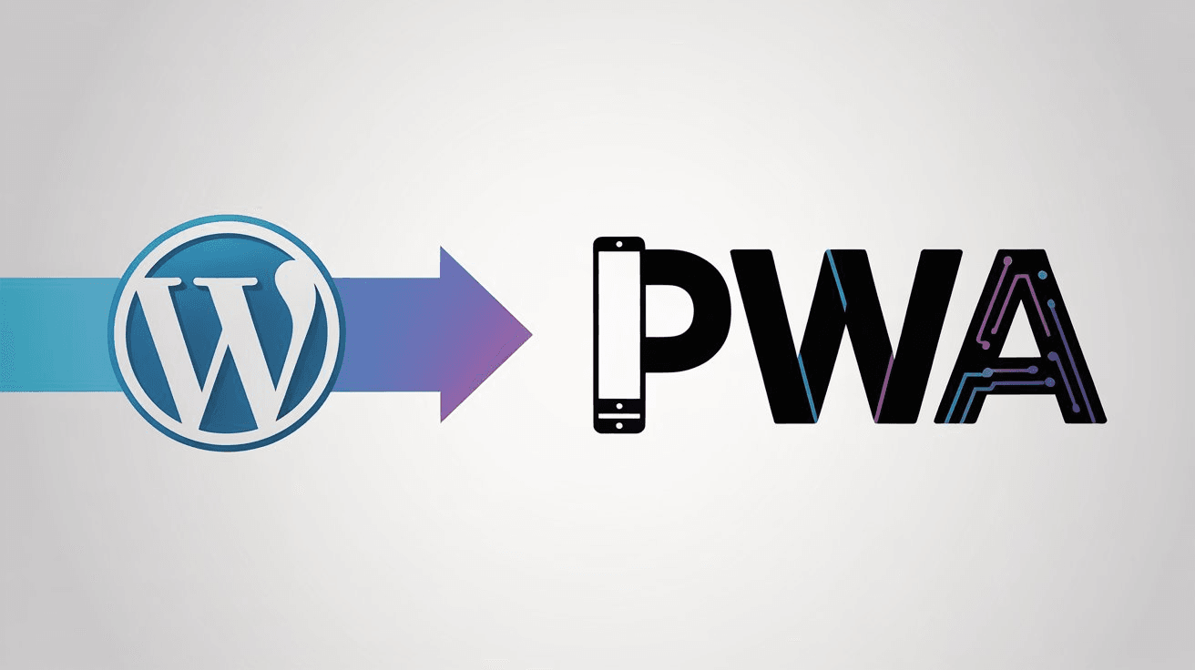 |
I already have a website, is there any way to make it into a PWA Mobile Application? |
The era of the traditional website editor has been well established over the past 20 or so years. As WordPress became the main website construction protocol, millions, if not billions, of websites have been created and many are still in use, although many have gone out of date with the increasing use of phones as the browser of choice for the connected of the world.
WordPress and traditional sites are losing out as the world moves more and more to the phone as the browsing device of choice, The websites simply do not fit into the small screen these devices provide. With the advent of mobile first requirements by Google on its algorthyms to select the sites at the top of the search engine reports, the traditional sites have often responded with a responsive technique that basically forces the full size website onto the phone's screen, often with disappointing results.
But with all that said, it is often too costly an exercise to redo a multi-thousand dollar website to properly fit onto a smartphone's screen.
Until recently, there really haven't been any valid options to redo a website onto the phone first and then worry about what it looks like on the big screen. With over 60% views of websites being seen on mobile devices, the need for redoing the sites have become much more important to keep in-step with the way technology is going.
In addition, many businesses have looked into building a native application to deliver their information and services to the internet. These often cost upwards of 5000.00 and are device specific, meaning different applications must be created for each basic device, android and apple at the minimum. The advantage of any mobile app is that your site is placed onto the home screen of the customer.
In the recent past, the concept of a PWA has been making more and more of an impact. Unlike a native app where the product must be built from scratch and designed to accommodate the needs of the device it is targeted towards, the PWA (Progressive Web App) uses a mobile first website as its basic substructure which is then transformed it into a self-contained app for the device it is installed upon.
The advantages are huge. First, the PWA is not subject to the rules and regulations of the native app stores, No registration or fees required,. Second it can be built as a simple website and deployed as such if you wish. That is where the building and refining takes place. When the Website is transformed into a PWA, it can easily be transferred to the home screen of the target device as through a URL or by a QRCode .
No downloading or other difficult processes are required. The client simply accepts the PWA as an icon on their home screen and your website/PWA is instantly and always available to the customer. Finally, changes in a native app are excruciating, as the entire structure must be modified and tested and often may require re-submission to the app stores.
In the case of a PWA, the website can undergo changes and updates using the site editor as much as required while the existing PWA remains constant. Once the updates require implementation, simply reapply the PWA structure and the site updates iteslf on the consumners phone auitomatically when it is usd the next time. Updates are painless and simple for boith designer and user.
As far as changing an established traditional website into a PWA, that is not possible, but there is a way to use present website technology and create a PWA that will allow your present site to be always be available on the home screen of the client. You will need to create a header PWA that allows the user to see your present website from it. Basically you create a PWA with a mobilefirst-personal or a mobileintros,ca website to link it to.
You have to build the "header" website as a mobilefirst-personal or mobileintros website and use the link feature to link the existing website as an external link that is accessible bty the header site. Once built, normally as a header digital business card, you can easily transform it into a PWA mobile application and have placed on the home screen of your client's phone.
The trick is simple once you have the header website created, all you need to do is link your present website as an external link to the header site and then transform your header into a PWA with the few clicks it takes for the mobile first platfrom to perfom the transformatin. |
Secret Little Hack |
Minimize the use of large images and media files to improve page loading speed. |
HTML remains a vital force in web development in 2025, driven by the mobile-first movement and the growing influence of Progressive Web Apps (PWAs).
The dominance of mobile internet has led developers to prioritize responsive, fast-loading sites that excel on both smartphones and tablets.
HTML5 supports this shift, offering semantic structure that boosts both accessibility and speed.
PWAs have reshaped the digital experience, blending the advantages of web and native apps with features like offline access, instant updates, and seamless device compatibility.
This evolution is all powered by a strong HTML foundation, making apps more versatile and efficient.
Innovations in Artificial Intelligence (AI) are now seamlessly incorporated into web apps using HTML, enabling smarter personalization and interactive voice features that deepen user engagement.
As the web evolves, HTML continues to adapt—ensuring innovation never comes at the expense of reliability or accessibility. Read More... |
Q/A Questions |
Q: How can mobile-first design benefit a website's usability? A: By prioritizing content and design for smaller screens, mobile-first websites ensure a smoother and more intuitive user experience on mobile devices, leading to improved engagement and conversions. Q: What are some key elements to consider when optimizing a website for mobile-first design? A: Some important aspects to consider include responsive layouts, fast loading times, simplified navigation, touch-friendly elements, and optimized images and videos for smaller screens. Q: What are the potential consequences of not having a mobile-first website in today's digital landscape? A: Without a mobile-first approach, websites may experience higher bounce rates, lower search engine rankings, and decreased user satisfaction, ultimately resulting in missed opportunities for reaching and engaging with mobile users. |