MobileFirst-Personal Websites
Archives
MobileFirst-Personal Websites Newsletter - December 23, 2025

Subscribe
MobileFirst-Personal Websites
Archives
MobileFirst-Personal Websites Newsletter - December 23, 2025
Steve Pond
Dec 23, 2025
December 23, 2025 |
Founder's Message: Take Back Control of Your Digital Life |
We've lost our way.
Today's social media landscape feels free—but the cost is everything that matters: your privacy, your data, your autonomy. Facebook, Instagram, and their counterparts aren't providing a service. They're harvesting you.
The internet never forgets.
Every post lives forever. That offhand comment from ten years ago? It's ammunition for today's character assassination. We've watched careers destroyed, reputations shattered, even lives lost—all because social media creates permanent records with no context, no grace, no room for growth.
You can't take it back. You can't erase it. Even when you try to delete your digital footprint, it remains—locked in stone, owned by corporations, accessible to governments, weaponized against you.
We've traded conversation for combat.
Social media demands absolutes. Black or white. No nuance. No evolution. No changing your mind when new facts emerge. Every position becomes a life sentence defining your character forever. But life isn't like that. Democracy thrives on discussion, not dogma. Growth requires the freedom to reconsider, to listen, to change.
You deserve better.
You should control who sees your thoughts—not algorithms shaped by corporate boardrooms and political winds. You should speak to people who matter, not perform for an audience determined by what drives engagement metrics.
Traditional websites solved this. But they were expensive and complicated.
Not anymore. Mobile-first platforms changed everything. For less than the cost of a fast-food meal—just $10 a month—you can own two fully customizable websites. Update them whenever you want. Transform them into mobile apps without certification hassles. Access everything from any device with a Chrome browser.
This is true ownership.
Will you reach millions overnight?
Probably not. But you'll reach the people who actually matter to you—your real audience, your customers, your community.
The choice is simple:
Keep feeding the machine that uses you, or build something you actually own.
Take back control. --- *MobileFirst-Personal and MobileFirstCanada: |
Trivia Question❓In the world of web design, what does it mean to have a "mobile-first" website? Answer at the bottom of the newsletter |
Do you know Why I Switched to Building Websites on My Phone (And You Should Too)
I can edit with the desktop size of the editor to see so much more in the beginning, but I don't have to.
And I'm doing it for a fraction of what I used to pay.
- Complete website development software - Full e-commerce capabilities - Course building features - Hosting included - No hidden add-ons - No surprises The only extra costs? A branded domain and MobileFirst SSL for 10/year if you want them. Or I can upgrade to their full-featured PWA (Progressive Web App) package for $30/month and build up to 20 different websites. Compare that to what you're currently paying. Really sit down and add it all up. I'm not saying this to brag — I'm sharing this because I wish someone had told me sooner. We're all trying to build our brands, serve our customers, and connect with people on the digital highway. Why should that cost a fortune? The best part? The editing experience is incredibly versatile and adaptive. I can make updates during my commute, between meetings, or while waiting for coffee. If you're curious about switching to a mobile-first approach or just want to compare costs, let's talk. I'm happy to share what I've learned. We have a starter plan that gives you a basic website platform for free so you can learn how easy this system really is, and how powerful even using only the most basic widgets. You need to learn how powerful this actually is! It is always a live site and includes hosting for free forever. What are you currently paying for your website? Drop a comment — you might be surprised how much you could be saving. |
Quote Of The Day |
"Design is not just what it looks like and feels like. Design is how it works." - Steve Jobs |
Mobile First-Personal Widget spotlight: ContentBlock |
Last week we used a corporate video on the header widget, perhaps the second most used widget of the 40 or so that are integrated into the platform. The most used widget is the contentblock widget,. It is where the heavy lifting is done the most since it is the framework that holds the main content of the site, as well as lot of other roles as well. From it you can offer, images, videos and even tables as required for the site you create. It is included in every plan that MobileFirst-Personal, it's Canadian cousin MobilefirstCanada, and the newest offspring MobileIntros of the Mobile First Personal platforms. |
 |
Tip of The Day |
Ensure that your mobile website loads quickly by optimizing images, using responsive design, and minimizing the use of plugins and scripts. This will improve user experience and help boost your site's search engine ranking. |
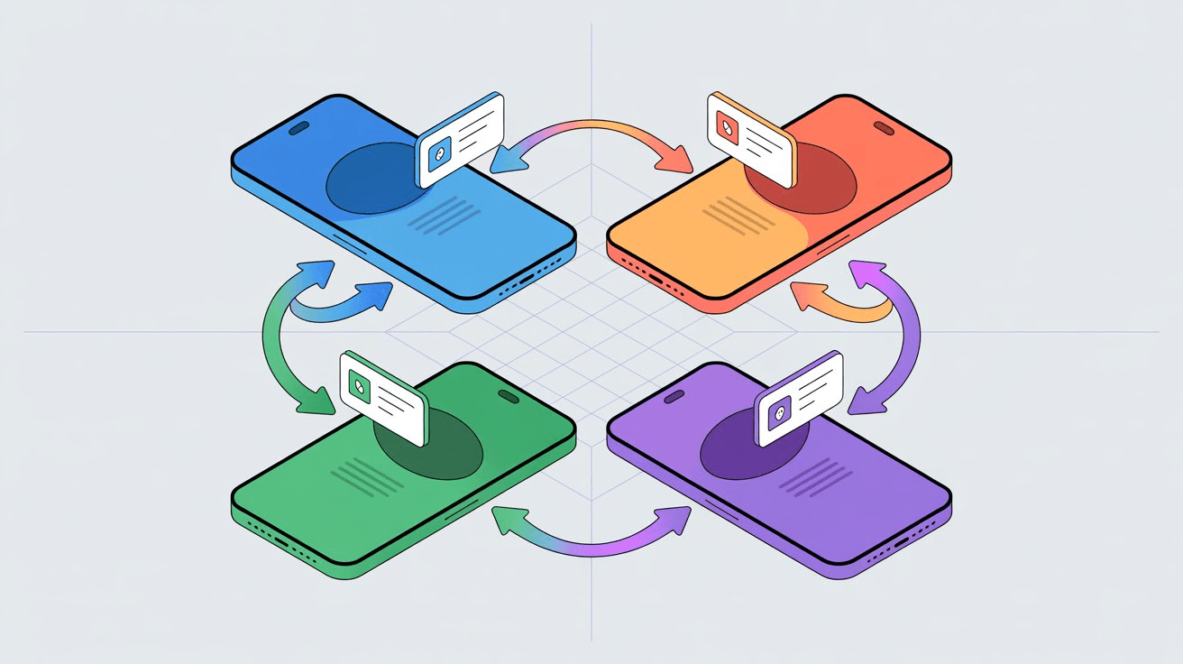
Progressive Web Apps (PWAs) are becoming popular for building secure, mobile-first social networks, appealing to people who value privacy in online interactions.
Affordable web platforms now let users create personal, password-protected PWAs, shared only with select friends or clients.
This results in closed, private communities, presenting a distinct alternative to mainstream giants like Facebook and TikTok.
Businesses and individuals are increasingly turning to PWAs to boost engagement and safeguard user data.
For example, Twitter Lite saw a significant surge in activity after adopting a PWA format, revealing their effectiveness in driving interactions.
PWAs also allow real-time push notifications, delivering instant updates to users and keeping groups—like families and interest clubs—closely connected.
Thanks to modern platforms with adaptive website editors, the once complex process of PWA creation is now much simpler and more interactive.
As a result, communities can now safely share and communicate, moving away from the risks found on large commercial networks. Read More... |
Interesting Facts |
|
Q/A Questions |
Q: What is the importance of having a mobile-first website design? A: Having a mobile-first website design is important because it ensures that your website is optimized for mobile users who make up a significant portion of internet traffic. This can improve user experience, increase engagement, and ultimately drive more conversions. Q: How can you make sure your website is mobile-first? A: To make sure your website is mobile-first, you should prioritize mobile responsiveness in your design, utilize a responsive web design framework, optimize images and content for mobile viewing, and test your website on various mobile devices to ensure compatibility. Q: What are some common mistakes to avoid when designing a mobile-first website? A: Common mistakes to avoid when designing a mobile-first website include using large images that slow down loading times, overcrowding the layout with too much content, neglecting to optimize for touchscreens, and ignoring the importance of page speed optimization for mobile users. |
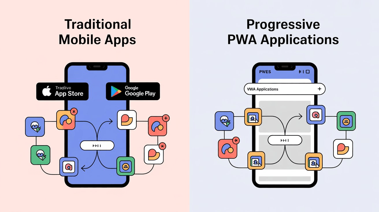 |
The dominance of traditional app stores is fading as users and developers pivot toward web-based solutions and Progressive Web Apps (PWAs).
People increasingly prefer seamless, browser-based access to platforms like Twitter, YouTube, and Spotify, reducing reliance on downloads and freeing up device storage.
Advances in technology and changing user habits are empowering developers to bypass strict app store policies, resulting in faster updates and broader device compatibility.
PWAs bridge the gap between native and web apps, offering offline access, push notifications, and easy installation, all while enabling efficient, unified development.
Regulations like Europe’s Digital Markets Act are driving change, allowing users to install apps directly and sideload alternatives, putting more choice in their hands.
The world’s biggest tech companies—Apple, Google, and Microsoft—are adapting by strengthening their PWA support, signaling a new era of digital access that prioritizes flexibility, speed, and user control. Read More... |
💡 Answer to Trivia Question: A mobile-first website is a website that is designed and optimized primarily for mobile devices, such as smartphones and tablets, before being adapted for larger desktop screens. This approach prioritizes the user experience on mobile devices, ensuring that the site is easy to navigate and visually appealing on smaller screens. |