MobileFirst-Personal Websites
Archives
March 31, 2026 - Mobile First Personal Websites

Subscribe
MobileFirst-Personal Websites
Archives
March 31, 2026 - Mobile First Personal Websites
Steve Pond
Apr 7, 2026
March 31, 2026 |
 |
A Message From the Founder |
Welcome to this issue of the Mobile First Personal Websites Newsletter. I am Steve Pond, and I have been building websites since 1996 when HTML was just getting started.
Over those nearly thirty years, I have watched the internet transform from a playground for tech enthusiasts into a corporate-controlled landscape where the little guy often gets squeezed out. That is exactly why I created the Mobile First Platform.
This week, I want to talk about something that affects every single one of us who has ever felt priced out of having a real online presence. The big platforms want you to think you need expensive developers, complicated software, and deep pockets to build something meaningful. They are wrong.
Every day, I see solopreneurs, hobbyists, and small business owners creating beautiful, functional websites using our mobile-first platform. They are taking back control of their digital real estate without breaking the bank.
In this issue, we are diving into how Gen Z is changing the mobile web landscape, why Progressive Web Apps matter more than ever, and taking a closer look at the Website Editor that makes it all possible.
Best Regards, Steve Pond |
Trivia Question❓Which famous tech company coined the term "mobile first" design in 2009, emphasizing the importance of mobile-friendly websites and applications? Answer at the bottom of the newsletter |
 |
Interesting Facts: Gen Z Is Changing Everything |
The Younger Generation is Redefining How We Consume Content
Gen Z, those born between 1997 and 2012, consumes information differently than any generation before them. According to recent Pew Research data, their habits are reshaping the entire digital landscape.
Smartphones Are Their Newsroom
For Gen Z, the smartphone is not just a device. It is their primary news source. While older generations still check desktop websites or watch evening broadcasts, Gen Z gets their information instantly, wherever they are. They do not wait for the six o'clock news. They get alerts in real-time.
Social Media Equals News Source
Platforms like Instagram and TikTok have become legitimate news channels for this generation. They discover breaking stories through shares, reels, and short videos rather than traditional news websites. A headline on Twitter might reach them before any formal news outlet.
Video-First Consumption
Short-form video dominates. Gen Z prefers watching a sixty-second explainer over reading a thousand-word article. This shift is forcing news organizations to adapt or become irrelevant. If you cannot say it quickly and visually, you lose them.
What This Means for Your Website
If you are building a website or online presence, remember this. Your audience is increasingly mobile-first and video-preferring. A slow-loading desktop site with walls of text will lose them instantly. They will bounce before the page finishes loading.
The Mobile First Advantage
This is exactly why mobile-first design matters. When your site loads fast, looks great on phones, and delivers content in digestible formats, you are speaking Gen Z's language. And that is becoming everyone's language, regardless of age. |
Quote of the Week |
"The future belongs to those who believe in the beauty of their dreams."
— Eleanor Roosevelt
Your website is the digital manifestation of your dreams. Build it beautifully. |
 |
Feature Article: The PWA Revolution Is Here |
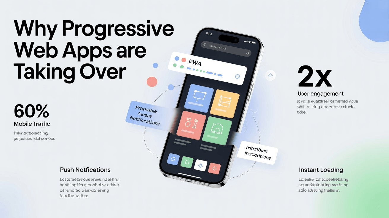
Why Progressive Web Apps Are Taking Over
You have probably heard the term PWA but may not realize how significant this technology has become. Progressive Web Apps combine the best of websites and native apps, and businesses are taking notice.
What Makes PWAs Special
A PWA works like a website, no app store needed, but behaves like a native app. It loads instantly, works offline, sends push notifications, and can be installed directly on a phone's home screen. Your users get the app experience without the app store hassle.
The Business Case
Companies adopting PWAs report dramatic improvements. Faster loading means lower bounce rates. Offline functionality keeps users engaged without internet. No app store gatekeepers means instant updates and no commission fees. One codebase works on all devices, iOS, Android, and desktop.
Real-World Success
Major brands have proven the model. Starbucks saw their PWA double daily active users. Pinterest rebuilt as a PWA and increased engagement sixty percent. Uber's PWA loads in three seconds even on 2G networks. These are not small wins. They are game-changers.
PWAs and Mobile First Platforms
The best part? Platforms like MobileFirst-Personal and MobileIntros are built on PWA technology from the ground up. When you create a site with us, you are automatically getting PWA benefits: fast loading, offline access, and installability, without any extra work.
The Future Is PWA
As mobile traffic continues to dominate, over sixty percent of all web traffic now, PWAs are becoming the standard for serious online businesses. The question is not whether to adopt PWA technology, but when. |
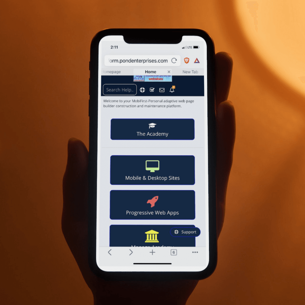 |
Widget Spotlight: The Website Editor |
Your Control Center for Digital Success
This week we are featuring the heart of the Mobile First platform: the Website Editor. This is where your vision becomes reality.
What Makes It Different
Traditional website builders force you into rigid templates. Our editor gives you forty plus widgets that you can arrange however you want on a page-by-page basis. Think of it like building with digital LEGO blocks.
Widget Categories
Content Widgets include text, images, videos, and galleries. E-Commerce widgets handle product listings, shopping carts, and checkout. Course widgets manage lesson modules, quizzes, and progress tracking. Business Tools include forms, calendars, and booking systems. Social Features cover comments, reviews, and member areas.
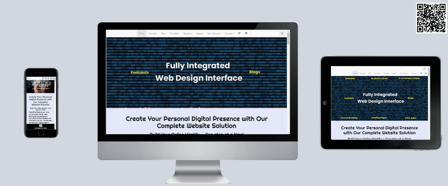
Mobile-First by Design
Here is the key difference: every widget is designed for mobile first. When you build a page, it looks perfect on phones automatically. Desktop and tablet layouts adapt from there, not the other way around.
Real User Example
One of our solopreneurs built a complete e-commerce site in a weekend. She started with a product gallery widget, added a shopping cart, connected her payment processor, and launched. Total cost: twenty dollars per month. Compare that to Shopify's thirty-nine dollars per month plus transaction fees.
Try It Yourself
Every MobileFirst plan includes the full editor, even the free sandbox. You can build and preview your entire site before spending a dollar. |
 |
Secret Little Hack |
Preview Your Site on Multiple Devices Instantly
Here is a trick most people miss. When you are building your MobileFirst site, you can preview how it looks on different devices without owning them.
In the editor, look for the device preview icons at the top of your screen. Click the phone icon to see your mobile layout. Click the tablet icon for tablet view. The desktop icon shows your full site.
But here is the hack: use your browser's developer tools for even more options. Press F12 in Chrome or Firefox, then click the device toolbar. You can test your site on dozens of different phone models, screen sizes, and even simulate slow internet connections.
This lets you catch layout issues before your visitors do. A five-minute check can save you hours of frustration later. |
Q&A: Mobile-First vs Responsive Design |
Question: What is the difference between mobile-first and responsive design?
This is one of the most common questions we get, and the distinction matters.
Responsive Design starts with a desktop website and then shrinks it down for smaller screens. It is like taking a large painting and cutting off the edges to fit a smaller frame. You lose detail and the composition suffers.
Mobile-First Design starts with the smallest screen and builds up. You design for mobile first, then add features and layout for larger screens. It is like starting with a sketch and adding detail as the canvas gets bigger.
The result? Mobile-first sites feel native on phones because they were built for phones first. Responsive sites often feel like desktop sites crammed onto a small screen because that is exactly what they are.
MobileFirst-Personal uses true mobile-first architecture. Every widget, every layout, every feature is designed for mobile first. That is why sites built on our platform load faster and feel more natural on phones than traditional responsive sites. |
💡 Answer to Trivia Question: Google |