MobileFirst-Personal Websites
Archives
MobileFirst-Personal Websites Newsletter - October 14, 2025

Subscribe
MobileFirst-Personal Websites
Archives
MobileFirst-Personal Websites Newsletter - October 14, 2025
Steve Pond
Oct 14, 2025
October 14, 2025 |
 |
From the desk of the Founder |
The Mobile First-Personal Website Philosophy
I have been creating websites for almost 30 years. I don't have any degrees and I certainly cannot code beyond the most basic HTML! So why do I offer a set of mobile first platforms like MobileFirst-Personal, MobilefirstCanada and MobileIntros that create websites as my main business?
It all basically stems from the fact that I can't code and find most advanced work on the computer exactly that - advanced. When I made my first websites in 1995, website design was basically as tamed as the wild west. Pages were made one by one in the HTML (Hyper Text Markup Language) 1.0. It was simple, easy to understand if I put some thought into it, but often required help from someone outside.
I made two websites, rchagen.com and tropicalfishaquarist.com. One for work and one for promoting my hobby: the care and maintenance of tropical fish in an attempt to share my personal expertise in an attempt to keep them alive and healthy by new aquarists. It was, and still is devoted to provide the information a novice aquarist would need to be successful.
Soon WYSIWYG editor appeared, some good, some bad, but all required a lot of work to produce pages. Then other styles of website creation appeared, these are the traditional WordPress blog that offered a free blog and the ability to integrate a wide assortment of plug-ins and widgets that required varying degrees of coding and development expertise. Coincidently, the price of keeping a website rose dramatically, you could still build a new website for free, but it cost a lot of time and a steep learning curve I was not able to invest in.
With complexity came outside expenses to keep a site operational, hosting, experts who could navigate the interface and many other expenses to keep the site protected from hackers and such. Over time the individual like myself was often driven out and the digital highway left to larger businesses who could afford to overcome the barriers to competition traditional website construction requires.
I kept looking and in the early 2020's I found a platform that was as robust, or in many cases much more powerful than traditional site builders that could do anything without using expensive developers, giving the control and creative power back to the individual - MobileFirst-Personal websites was born. It provides an easy to understand, and create, adaptive website editor that anyone, even without any technical skills can build and control their own website as webmaster and designer.
Finally the little guy, the solopreneur, small local business and even an individual can create and control their own digital presence without spending a lot of money to do it. There is a free plan the Sandbox that offers a basic website to play with, it is fully live and hosted costing the webmaster nothing to experiment with the independence and freedom of building a proper digital presence. A professional digital business card costs as little as 24 a year and provides the small guy a powerful introduction onto the digital highway that is personal and not subject to large megacorporation's whims.
|
 |
Many people now take their smartphones into the bathroom, making doomscrolling a regular part of daily routines.
New research suggests this common habit could raise health concerns, particularly the risk of hemorrhoids.
A study of 125 adults showed that 66% used mobile phones during bathroom visits, with over a third lingering for more than five minutes per session.
Compared to those who didn’t use phones, these individuals faced a 46% higher risk of developing hemorrhoids—even after factoring in age and lifestyle.
Hemorrhoids, marked by swollen veins and discomfort, are linked to extended time on the toilet, as increased pressure in the area leads to the condition.
Health experts advise limiting bathroom stays and keeping phones out to safeguard well-being. Read More... |
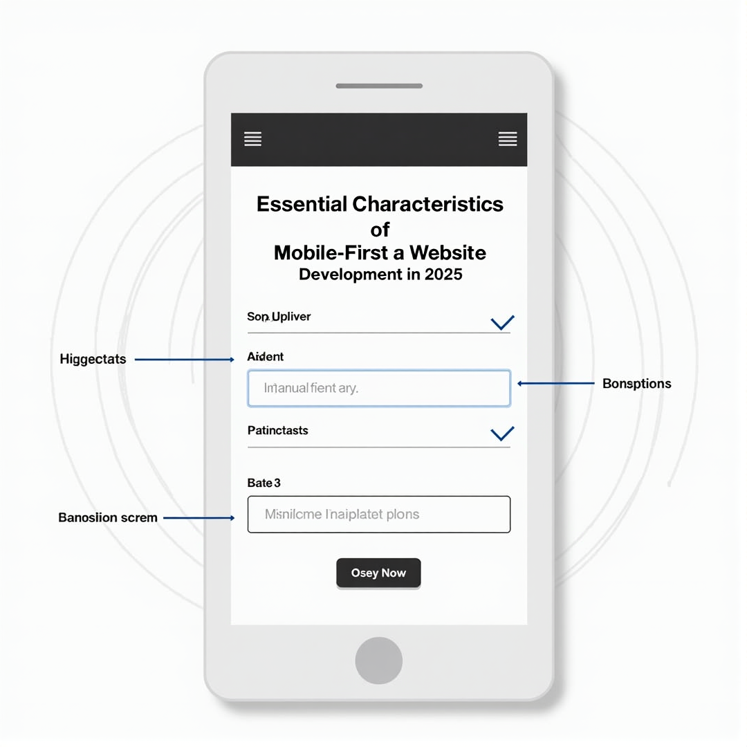 |
In 2025, a mobile-first approach in website development is more important than ever, with over 60% of global web traffic now coming from mobile devices.
Prioritizing mobile users ensures websites deliver a smooth, consistent experience across smartphones, tablets, and desktops.
Responsive design uses flexible grids and media queries, so sites automatically adjust to any screen size.
Speed is also essential — optimizing images, refining code, and using browser caching help sites load in seconds, keeping engagement high.
Touch-friendly navigation, clear menus, and larger buttons make interacting on mobile easy and intuitive.
AI-powered personalization further elevates experiences, offering dynamic content based on user preferences.
Voice search optimization and progressive web apps improve accessibility and make websites feel like seamless mobile apps.
By implementing these strategies, businesses stay competitive and relevant in an evolving digital world. Read More... |
 |
Building a standout online presence is crucial for both individuals and businesses in today’s digital age.
Crafting a website from the ground up often feels overwhelming and expensive.
HTML templates offer a practical solution, delivering pre-made, customizable designs that save money and time.
With a sharp focus on mobile-first design for 2025, most templates ensure your site looks great and functions flawlessly on any device.
Responsive layouts help reach the growing mobile user base, enhancing accessibility and user experience.
Templates also streamline development, lowering costs and speeding up launch times without sacrificing quality or style.
Easy customization means you can align every detail—from colors to layout—with your brand vision.
Prioritize mobile responsiveness, SEO optimization, and support when choosing the right template.
Start your web journey confidently by harnessing the efficiency and creative potential of HTML templates. Read More... |
 |
Mobile-first design is now essential as mobile devices account for over 60% of global web traffic.
Prioritizing mobile optimization with responsive layouts, quick load times, and thumb-friendly navigation creates a seamless browsing experience.
This focus not only boosts user engagement but also improves search engine rankings.
Integrating artificial intelligence (AI) into web design is transforming how visitors interact with digital platforms.
AI-driven personalization serves up dynamic content tailored to each user's behavior, preferences, and location, delivering a more engaging experience.
Meanwhile, smart chatbots offer instant support, enhancing customer service and reducing bounce rates.
As AI capabilities grow, its influence on web design will deepen, making websites more intuitive and responsive.
Businesses that embrace mobile-first, AI-powered strategies are best positioned to meet the evolving needs of today’s tech-savvy users. Read More... |
 |
The surge of artificial intelligence is reshaping mobile app development, powering a mobile-first wave in cities like Las Vegas.
Advanced tools such as GitHub Copilot and FlutterFlow now automate coding and simplify design, allowing startups to quickly launch cross-platform apps without large teams.
In healthcare, AI assistants help clinics streamline tasks like appointment scheduling and follow-ups, boosting efficiency for local patients and providers.
Yet, the heart of an app remains its human touch.
Successful applications rely not just on smart automation, but on thoughtful design that builds real trust and emotional connection.
Las Vegas-based tech firms are blending AI-driven efficiency with creative, human-centered strategies to deliver standout user experiences.
Going forward, the most impactful apps will merge AI innovation and human insight—to deliver tools that are functional and thoughtfully engaging. Read More... |