MobileFirst-Personal Websites
Archives
MobileFirst-Personal Websites Newsletter - Seoptember 2, 2025

Subscribe
MobileFirst-Personal Websites
Archives
MobileFirst-Personal Websites Newsletter - Seoptember 2, 2025
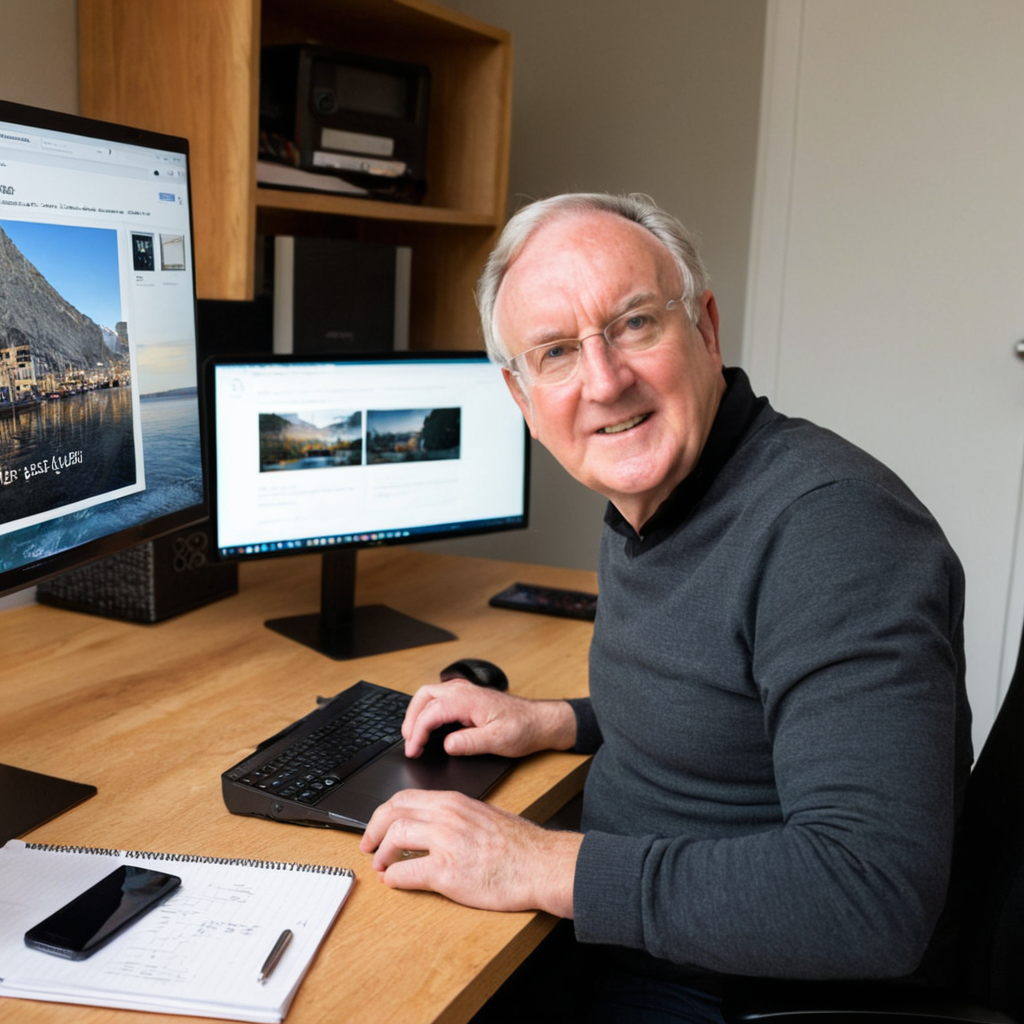
Steve Pond
Sep 2, 2025
September 2, 2025 |
 |
Founder's Message |
The mobile internet is truly a very different animal than the desktop spaces most websites and programmers are trying to reach. You must follow a number of rules to ensure that your content is visible, readable and effective on the tiny screen so many of us have adopted as our personal happy place. It gives us entertainment, news, social connection and so many other reinforcements that no other machine or personal seems to be able to provide. And all of this has happened since the early part of the century.
Growing up today is a very different experience than what I was exposed to in the 50's and 60's. At the age of ten, I was expected to be outside, often riding my bike, wherever I felt like - SAFELY and without worry. That could be a radius of ten to 20 miles from home; once I was freed from school. I got lots of exercise, fresh air, sometimes into trouble. I made mistakes, but I always had to make sure I was home by the time dinner was on the table.
These days, the exercise and requirement to be out of the house until supper rarely is a possibility today. Streets and neighborhoods are so dangerous that children have to be supervised full time to keep them safe, out of the hands of pedophiles, drug dealers or even the deadly vehicular traffic of modern days.
The mobile phone has become a substitute for beneficial social contact, face to face is rare, unless forced by health or employment. Rather the world has become smaller for most where they are kept confined into smaller and smaller spaces for extended periods of time. The only escape has become the interfaces on their computing devices, the desktop, laptop and mobile phone. While the desktop use is still enormous, the actual percentages seem to say that they are declining while the constant companion of most is their mobile phone.
Originally this newsletter was created to promote and explain the powerful mobile first website platform I offer for as wide an audience as I can. I want to leave a legacy where they are allowed to get onto the internet with an even playing field. MobileFirst-Personal websites allow anyone to promote whatever you need or want to as a solopreneur, small business or individual. By far, my plans offer the most value for the least amount, able to change the way anyone interreacts with the digital highway. Not as a simple user, but as a webmaster beholden to no major corporation or social media platform siphoning your data and personal information, telling you what you can and cannot do, or punishing you because you break their arbitrary rules.
But, my viewpoint has become much wider. You can find links to the MobileFirst-Personal Websites, MobileFirstCanada and Mobileintros platforms here, and in other places in the newsletter. This newsletter is enlarging its scope to include the entire range of mobile first topics. This is the place to find a wide variety of topics about the use of the mobile phone and how it integrates into the internet and digital highway. Not just as a website development platform, but the trends and topics that may be of use on a much broader scale.
Welcome to the new MobileFirst-Personal Websites newsletter, we hope that you will find a wide variety of interesting articles on all sorts of topics. We want you to keep you coming back as a valued subscriber.
Best Regards, Steve Pond |
 |
 |
Social media is now a central part of family life, allowing loved ones to share updates and stay in touch effortlessly.
Yet, privacy risks have surged, with large-scale breaches—like Facebook’s 2023 incident affecting over 500 million people—exposing sensitive information to potential misuse.
The rising trend of “sharenting”, where parents share details about their children online, also sparks debate over consent and can strain family trust.
Many kids express discomfort with the amount shared, creating tension at home.
Constant scrolling can also weaken traditional family connections, as screen time replaces meaningful interactions and leaves some members feeling isolated.
Concerned about these issues, more families are choosing private websites to exchange photos and news securely, limiting access and maintaining control.
This approach not only protects privacy but also nurtures closer, more genuine family bonds offline and online.
Read More... |
Q/A Questions |
Q: What's the key difference between mobile-first and responsive design approaches?A: While responsive design adapts desktop sites for mobile, mobile-first design starts with the mobile experience as the foundation. This means designing and coding for the smallest screen first, then progressively enhancing for larger screens using CSS media queries. This approach typically results in faster load times, cleaner code, and a more intuitive user experience across all devices. Mobile-first forces you to prioritize essential content and features, eliminating unnecessary elements that can slow down mobile performance.
Q: How should I optimize images and media for mobile-first websites?A: Implement a multi-pronged image strategy: use responsive images with the `<picture>` element and `srcset` attributes to serve appropriately sized images for different screen densities and sizes. Compress images using modern formats like WebP or AVIF, with fallbacks for older browsers. For personal websites, aim for images under 100KB each. Consider lazy loading for images below the fold, and use CSS for simple graphics instead of image files when possible. Don't forget to optimize for retina displays by providing 2x versions of critical images.
Q: What are the most important performance considerations for mobile-first personal websites?A: Focus on three core areas: Speed - aim for a First Contentful Paint under 2 seconds by minimizing HTTP requests, using a Content Delivery Network (CDN), and implementing critical CSS inline. Size - keep your total page weight under 1MB, compress JavaScript and CSS files, and remove unused code. Usability - ensure touch targets are at least 44px, implement fast-loading web fonts with proper fallbacks, and test extensively on real mobile devices with slower connections.
Use tools like Google PageSpeed Insights and Lighthouse to monitor and improve your Core Web Vitals scores. |
 |
The Ultimate Communication Tool for Solopreneurs and Growing Businesses |
Why seamless mobile connectivity is becoming the backbone of modern business communication
Running a business in 2025 doesn’t look like it did even five years ago. Solopreneurs and small business owners are juggling multiple hats managing clients, creating offers, sending invoices, and still trying to stay connected on calls, chats, and collaborations. The challenge? Business communication is scattered across too many tools, eating away at time and productivity.
Disconnected Communication Hurts Growth Think about a typical workday as a solopreneur or in a small team:
According to a 2024 McKinsey study, knowledge workers spend 28% of their time on email and another 20% switching between collaboration tools. That’s nearly half of the workweek wasted just managing communication. For a solopreneur, that wasted time is money.
Why Businesses Are Moving Toward Unified Communication Here’s what’s happening right now:
|
 |
Microsoft Teams Phone Mobile in Action Imagine if your regular mobile phone number seamlessly became part of your business communication hub. That’s exactly what Microsoft Teams Phone Mobile does.
Here’s how it solves the communication chaos:
How Solopreneurs Can Adopt This
For solopreneurs, credibility and efficiency are everything. Having a professional, unified communication system makes your business look bigger, more trustworthy, and more organized even if you’re still running things from your living room. And for growing businesses, it’s about scalability. The sooner you set up a system that grows with you, the less time you’ll waste fixing messy communication later.
Here’s the truth: having the right communication system is only one piece of the puzzle. Your digital presence also matters especially your website. What’s the point of having professional communication if your clients land on a half finished site or can’t find your services easily on mobile?
That’s where MobileFirst Personal comes in. Just like Teams Phone Mobile streamlines your calls and chats, MobileFirst Personal makes creating a mobile friendly, professional website effortless. In under an hour, you can launch a simple, optimized site that works beautifully on any device no coding required.
If you’re ready to save hours, stop juggling apps, and look more professional as a solopreneur or small business, it starts with simplifying your communication and your online presence. Explore MobileFirst Personal today and see how easy it is to launch a mobile-first website that works as hard as you do. Combine it with smart tools like Microsoft Teams Phone Mobile, and you’ll have a setup that not only saves time but also helps you grow with confidence. |
Secret Little Hack |
Minify and concatenate your CSS and JavaScript files to reduce loading times and speed up your mobile website. |
Adopting a mobile-first strategy is now vital for the success of small businesses, especially in rural communities.
While 42% of rural businesses still depend solely on in-person sales—significantly more than the 17.4% seen in urban areas—this divide reveals a pressing digital gap that can stall growth.
Embracing digital tools like mobile-optimized websites, e-commerce, and social media has the potential to boost rural commerce, but adoption remains uneven.
Although 79% of small businesses nationwide may use cloud platforms by 2025, rural enterprises continue to face obstacles updating their technology.
Banks, processors, and FinTech firms play a crucial role in supporting these transitions, offering tailored solutions and improved pathways for digital payment adoption.
With nearly 70% of internet use now on mobile devices, optimizing for mobile is not just beneficial—it’s a business necessity.
Rural small businesses that prioritize digital tools can expand their reach, engage more customers, and strengthen competitiveness in today’s marketplace. Read More... |
 |
California companies are rapidly embracing mobile-first web design in 2025 to keep pace with evolving user demands and stricter regulations.
With more than 70% of web traffic now coming from mobile devices, businesses must optimize their websites for mobile responsiveness to stay relevant.
Recent studies show that 73% of internet users access the web exclusively via phones, making mobile-friendly design a top priority.
Companies are focusing on performance, since even a one-second delay in loading can slash conversions by 7%.
To speed up sites, teams are using image compression, lazy loading, and powerful Content Delivery Networks.
Accessibility is also under the microscope, as California sees a surge in ADA lawsuits over digital access.
With mobile commerce set to top $620 billion nationally by 2025, local firms recognize that fast, accessible, mobile-first sites are now a fundamental necessity. Read More... |
Quote Of The Day |
"Design is not just what it looks like and feels like. Design is how it works." - Steve Jobs |