MobileFirst-Personal Websites
Archives
MobileFirst-Personal - July 8, 2025

Subscribe
MobileFirst-Personal Websites
Archives
MobileFirst-Personal - July 8, 2025
Steve Pond
Jul 8, 2025
July 8, 2025 |
 |
The Parts of a Mobile First Website
The mobile first technology has become a stable alternative to traditional website creation editors. When Google shifted its focus from the traditional websites to give more credit to the speed of website loading and mobile first websites, a fundamental change occurred in the way we now access the information available on the digital highway.
Mobile First technology is the wave of the future. More phones are now being used to browse and purchase on the internet than any other devices. Isn't it time for you to consider the advanced features of a mobile first platform whenever you are developing a site, since they are the fastest loading and most dedicated to the best possible performance on the you phone's browser.
Traditional platforms develop and deliver websites optimized for the large screen monitors of desktops and laptops. Once the site is finished algorithms cram the details and functions of a desktop site into the small screen of a mobile phone using responsive technology. This often loses the ability to create sites that are truly optimized for the phone screen, the place where customers are actually viewing the site.
Mobile first technology fundamentally changes the way the site is developed right sown to the actual building blocks used. they may be termed the same : Pages, themes, templates, plug-ins and widgets, but the two styles of development are completely different.
This issue is devoted to highlighting the differences that make the moile first adaptive platform different from any other traditional website construction editor available. |
 |
Quote Of The Day |
"A mobile first strategy isn't just about design; it's about ensuring your entire online presence is optimized for mobile users." |
The Page |
The main building block of Mobile First technology
Traditional website editors are quite varied and may assemble the sites in different ways, but most require a theme to be used to provide the framework of the site - locking it into a specific set of features before the first page is designed. While mobile first platforms do allow the use of templates, or themes, to add a specific homogeneous framework to the site, they are not strictly required like WordPress and other platforms require. While for many having a specific framework seems useful, Mobile first allows you to build the mobile first site right from scratch.
The main building block is the Page. The page is used to control the navigation and the way the site is displayed on the screen, no matter the resolution. By moving back to the original HTML perception of a page, each section of the site is a truly independent piece, making it easy and efficient to load. The navigating is directly dependent on the way the pages are loaded. Main headers on the navigation bar represent the topmost page in a list of pages, any of which can be brought to the front to display as a navigation heading, or indented below to create sub menus automatically.
The "Page" is an independent unit, it acts as a whole and does not bleed across other structures in the site. When a page is loaded, no other parts are required to load in the background, increasing load speed and clarity. WordPress sites often share structures across a blurred set of pages, requiring the load to include a lot of other data that is not necessarily useful for a given heading.
The indented structure and the ability to hide a page from view allow the webmaster/developer to create complex navigational structures easily, with little or no effort on their part. The site is constructed from top to bottom using the page as the distinct controlling unit.
If the page is all the way to the left, it is a main header on the navigation structure, other subpages instantly become submenus in the nav bar as they are indented to the right. What is placed on the page defines the way the page is displayed on the browser. The mobile first-personal platform is so powerful that the pages can be tweaked simultaneously to be optimized for both the mobile phone screen and the desktop/laptop monitor simultaneously. Since the phone screen is the most important display, a real time mock-up is part of the full size editor view.
The way the page is constructed is quite different, since the building blocks are available to be added from a single selection page. The page can be extremely complex, but all requirements installed on a single page, or expanded over a wide number of pages defined to display separate functions.
Pages are not just a simple container that holds the code that the browsers read and display. There are a number of sections that help to define the power of the page. These are mostly off page functions like a clear place to enter SEO definitions, permissions for the user and visibility are included here. The page carries the functions it is designed to perform. It also has easy to understand setting that make it an extremely powerful building block. Other settings define the differences between the way the page is displayed on the phone as opposed to the desktop resolutions that by definition must be different for pleasurable viewing. |
Trivia Question❓Who coined the term "mobile first" and introduced the concept of designing websites with a focus on mobile user experience before desktop? Answer at the bottom of the newsletter |
The Template vs. From Scratch |
Starting from Zero: The Freedom of the Blank Canvas
The Template Trap
Here's a secret web designers don't want you to know: those beautiful templates that promise to make your life easier often make it harder. You choose a template because you like 80% of it, spend hours trying to change the 20% you don't, discover changing one thing breaks three others, then either give up or pay hundreds for someone to "fix" it. This is why so many websites look identical—they're trapped in the same templates.
The CSS Mystery Box
In traditional templates, CSS is like a recipe written in a foreign language with ingredients hidden in twenty cupboards. Want to change your header color? Good luck finding which of 500 lines controls it. Change the wrong line and suddenly your footer floats mid-page. Even experienced developers approach template CSS with caution. For business owners wanting a professional website? It might as well be rocket science.
The Blank Page: Your Superpower
Mobile-first development offers something revolutionary: starting with absolutely nothing. This isn't terrifying—it's liberating. Starting from nothing means infinite possibilities and zero obstacles. Using a template is like buying a furnished house and trying to redecorate (stuck with the floor plan, removing ugly wallpaper might damage walls, spending more time removing what you don't want). Starting from scratch is building your dream home (every choice is yours, nothing needs undoing, you know where everything is because you placed it).
Real-World Success: Sarah's Bakery
Sarah tried both approaches. With a template: chose restaurant theme (closest to bakery), spent 3 weeks trying to remove "wine list" section, paid $500 for color changes, couldn't remove "Reserve a Table" buttons, settled for a "restaurant" site. Starting from scratch: added her logo and exact brand colors, created simple pastry menu, built custom order form, finished in 2 days, spent $0.
The No-Code Revolution
"From scratch" doesn't mean "from code." Visual tools translate your choices into perfect code behind the scenes. Change header color? Click and pick. Need different font size? Slide a slider. Want different colors per page? Just change them—no forced uniformity. Every step is positive progress: add logo → site improves, choose colors → site improves, place content → site improves. Compare this to templates where removing unwanted elements risks breaking everything.
Your Safety Net
Mistakes in mobile-first development are just experiments. Every change shows immediately in preview. Don't like it? Undo. Unlike template CSS where one wrong character crashes your site, visual builders are forgiving. You can't "break" anything because you're not touching code. The Style menu is your control center: pick any color for any element, choose from hundreds of fonts, adjust spacing with sliders, optimize for mobile without affecting desktop—all without writing code.
Getting Started
Begin with just your logo and business name, add one element at a time, check mobile preview, adjust as needed, repeat. Each addition is a small victory. Want purple header on home page but green on contact? Do it. Need extra-large buttons for older customers? Make them. This is your website—why follow someone else's rules?
The Bottom Line
Templates promise time savings but cost more in frustration and compromise. Starting from scratch with mobile-first tools gives you complete creative control, faster results, exactly what you want, confidence in your abilities, and money saved on developer fees. Every professional website started as a blank page. Now you have tools making the journey from blank to brilliant accessible to everyone. |
Q/A Questions |
Q: What does it mean to design a website with a "Mobile First" approach? A: By designing a website with a Mobile First approach, the focus is on creating a user experience that is optimized for mobile devices first, before considering how it will look on larger screens. Q: Why is it important to prioritize mobile design for websites? A: Mobile devices are now the most popular way for users to access the internet, so it is crucial for websites to be easily navigable and visually appealing on smaller screens. Q: What are some key elements to consider when designing a Mobile First website? A: Some key elements to consider when designing a Mobile First website include responsive design, fast loading times, simplified navigation, and optimizing images and content for mobile viewing. |
Widgets - The Heart of the Matter |
Designing the page withfundamental building blocks
Mobile First technology is simple when you compare the way a page is configured to the traditional route. The page is the main display block for the site. The widget is the main way the page is designed to provide the ultimate look. The mobile first widget roughly compares to the WordPress units of Plug-ins and widgets. The difference is that the only place the widgets can be found is the actual page editor. WordPress has many confusing desktop menu entries to control and install plug-ins and widgets for use.
The widget offers the functionality to the website for all the different needs in building a website to your specifications. The page, in the MobileFirst viewpoint, is a container where the widgets perform their tasks as defined. The WordPress page is a much more fluid space where a large number of different actions can be performed, often with some loss in performance. Plug-in and widgets can be used on the WordPress page, but as the pieces are open source, they may not play nicely together.
The widget, in the mobile first universe is a purpose built piece that is created with total compatibility in mind. All the widgets work together as a team, producing extremely efficient pages that load fast and operate as expected at all times. While WordPress has evolved to be all things to all people, and if it isn't, someone will build a patch that can add the missing functionality. Mobile First has a set number of widgets that, in my estimation, basically covers all the functionality any site may require. Failing that, there is even a widget, called the code script, that allows external products to be displayed and operate on the site as well. Some third party items, like form fillers and calendars are available to fill holes, but usually that are also filling holes in the WordPress sites as well.
The widget is where the heavy lifting is performed. Text editors, list builders and graphics displays are all integrated into the widgets. Most of the widget have size modifications, so adding them in and sizing them properly gives you a very high level of control over the look and feel of each page - all without bothering with coding or other difficult webmaster/developer chores. |
Cloning Limits |
How big is big?
Understanding Site Size and Backup Realities
The Universal Challenge of Website Portability
Let's address an uncomfortable truth that website platform providers rarely discuss openly: moving your website from one place to another is harder than it should be. Whether you're using WordPress, Wix, Squarespace, or any other platform, true portability remains elusive. This isn't necessarily malicious—it's a consequence of how differently each platform structures and stores your website data. It's like trying to move a house built with American measurements to a country that uses metric. Everything needs to be translated, and something always gets lost in the process.
WordPress: Big Sites, Bigger Headaches
WordPress powers 43% of the internet, from tiny blogs to massive news sites, but this flexibility comes with complexity when it's time to move or duplicate your site. While WordPress theoretically has no hard page limit and databases can handle thousands of posts with resources as your only limitation, the practice tells a different story. Sites over 100 pages become unwieldy to manage, backup files exceeding 500MB often fail to restore properly, and plugin conflicts multiply exponentially with site size. Migration plugins themselves frequently time out on large sites.
Cloning Your WordPress Site
Popular tools like UpdraftPlus, WP Clone, and All-in-One WP Migration promise easy site duplication, but each has significant limitations. Free versions restrict file sizes (often 40-100MB), while paid versions extend this but still struggle with very large sites. The real challenge lies in the complexity of moving databases, files, plugins, themes, settings, user data, and custom configurations all at once. Success rates vary wildly based on hosting environments, server configurations, plugin combinations, and theme complexity. What works perfectly on one host might fail completely on another.
Mobile-First Platform Limitations
Mobile-first platforms face their own portability challenges. MobileFirst-Personal Websites typically limit individual sites to 20 pages, adequate for most business sites but restrictive for content-heavy projects. Sites must stay under 1GB total size, and while cloning works well within the platform, exporting to other systems proves problematic due to incompatible structures. Backup options usually include simple page duplication and full-site templates but lack true external portability.
Why These Limits Exist
Performance optimization drives many of these restrictions. Mobile-first platforms maintain speed by limiting site complexity, preventing the bloat that makes sites slow to load and difficult to maintain. Resource management also plays a role—smaller sites mean predictable server loads, consistent backup performance, and reliable cloning operations. Platform lock-in, while frustrating, isn't always intentional. Different code structures, unique database schemas, proprietary optimizations, and custom frameworks make true portability technically challenging regardless of business motivations.
Wix and Squarespace: Beautiful Prisons
Proprietary platforms like Wix and Squarespace offer stunning designs but minimal portability. These platforms provide no true export function for complete sites, limiting you to copying and pasting content manually. Their internal backup systems work well within the platform but offer no external access. Some third-party tools attempt scraping content, but they miss dynamic features, interactive elements, and custom code. Starting fresh elsewhere often proves easier than attempting migration.
The Reality Check
No platform offers perfect portability—each makes trade-offs between features, performance, and flexibility. WordPress provides maximum flexibility but with complexity and compatibility issues. Mobile-first platforms offer simplicity and speed but with size restrictions. Proprietary platforms deliver polish but at the cost of lock-in. Understanding these limitations before choosing a platform can save significant frustration later.
Working Within the Limits
For most business websites, 20 pages covers everything needed: home, about, services, contact, blog, and supporting pages. Maximizing your impact within constraints often leads to better, more focused websites. Consider using external services for specialized needs—email platforms for newsletters, cloud storage for downloadable files, dedicated systems for extensive databases, and separate platforms for resource libraries. This modular approach keeps your main site lean while providing unlimited expansion possibilities.
Backup Best Practices
Regardless of platform, smart backup strategies are essential. Store content in multiple formats by keeping original text in documents, saving images in organized folders, documenting your site structure, and maintaining records of settings and customizations. Create redundancy through scheduled automatic backups, manual exports of critical content, screenshots of important configurations, and offline copies of everything important. Test your recovery process regularly—a backup you can't restore is merely wasted disk space.
Future-Proofing Your Content
The most portable asset is well-organized, platform-agnostic content. Write in simple formats easily transferred between systems, organize images and media in clear folder structures, keep style separate from content, and document everything for future reference. Think of your platform as a presentation layer for your content, not its permanent home.
Making Peace with Platform Limits
Rather than fighting platform limitations, embrace them as creative constraints. A 20-page limit forces clear, focused messaging. Size restrictions encourage efficiency and performance. Limited cloning options remind us to build thoughtfully from the start. The goal isn't building the biggest site possible—it's building the right site for your audience. Platform limits often guide us toward that goal, even when they frustrate us along the way.
Your content remains yours regardless of platform. With proper planning and realistic expectations, you can work within any system's constraints while maintaining the flexibility to evolve as your needs change. Choose your platform based on your actual needs today, not theoretical needs tomorrow, and always maintain platform-independent backups of your critical content. |
Creating Mobile Apps |
The PWA Option
The MobileFirst -personal platform has the ability to make any site constructed with the adaptive editor into a PWA (Progressive Web App) in just a couple of clicks. This not something that is simple for any traditional website editors.
The PWA is a separate module that allows you to change the way your site is viewed and used on a clint's home screen. It becomes a full featured mobile application that is independent of the internet as it can be accessed even when there is no internet connection.
It takes only one page of settings to change the Website into a PWA. Open any site that has its own domain defined and then fill out a few field in the Progressive Web Apps section of the left hand menu and the PWA is ready to deliver to anyone's phone or other device. It is a separate application, but doesn't need permission or acceptance from the Google or Apple stores to upload to a client's phone. Once there, you have all the power of a mobile app available, including push notifications.
All plans except the Sandbox Plan include the PWA module. The only added requirement is that you install your personal domain and purchase a MobileFirst SSL certificate for the site.
Then it is simple:
Create a website with the MobileFirst-Personal site plan of your choice
While it is recommended that the site be finished before the PWA is created, we all know that there may be changes required over time after the information is delivered to the site. Should this occur and the PWA needs to be edited, it is a simple process. Simply edit the underlying site as required, once the site is back into the right shape for the internet, simply reapply the PWA setting to update the active PWA. Over time the new version of the PWA will propagate to your established clients, usually when their version of the site is opened, then it will be effortlessly updated to the newest version. |
Interesting Fact |
Every expert was once a beginner who decided to share what they learned along the way. |
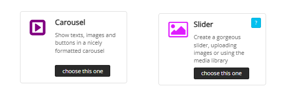
Sliders and Carousels
Whether you are creating a digital business card, a products website or any other style website, in many cases you will want to have a slide show of a range of graphics. The MobileFirst-Personal widget selections include a couple of widgets that are designed to make the process easy and interesting t the viewer.
The slider is part of many page definitions as a default. It allows the Webmaster to define the way the slider changes the multiple graphics that have been uploaded to it, either graphics from the general picture library or specific graphics uploaded personally by the developer.
When creating a slider, it is best to crop the graphics to a uniform size. When the graphics are of assorted sizes, there will be format differences that may not be pleasing as the final result.'
The carousel takes the concept of a slider to a more refined level and allows more configurational power and flexibility |
 |
Questions or Comments? |
Contact us directly at MobileFirstPersonal@gmail.com |
 |
Subscribe to the MobileFirst-Personal Newsletter |
Visit our LinkedIn Page: |
Visit our Facebook Page |
Visit our Instagram Page |
Visit our YouTube Channel |
Access Our Past Issues Archive |
💡 Answer to Trivia Question: Luke Wroblewski |