MobileFirst-Personal Websites
Archives
MobileFirst-Personal Websites Newsletter - April 15, 2025

Subscribe
MobileFirst-Personal Websites
Archives
MobileFirst-Personal Websites Newsletter - April 15, 2025
Steve Pond
Apr 15, 2025
2025 - April - 15 |
 |
Changing the way Websites are Conceived, Built and Maintained by the Modern Webmaster Hello everyone, The MobileFirst-Personal website creation and hosting platform is not your average traditional HTML website creation editor. It is a completely different system from editors that have historically been used by business to deliver goods and services to users in a one way direction. Those websites must be strictly designed and implemented in rather regimented ways. The actual creation often requires rather advanced technical skills and rarely can be handed over to the owner of the asset for their continued monitoring and improvement. The "finished" product is rarely that, a website that can be allowed to operate with little or no hands on oversight. The platform is usually in a constant improvement mode and upgrading for robust sites is often and usually disruptive to the many parts and pieces that have been bolted onto the main code as required for the features the webmaster demands. All of these, in ordinary website platforms, must be constantly maintained to ensure compatibility and it falls the webmaster to ensure the parts and pieces all work together, continuously and flawlessly. The result of this constant change within the parts and pieces of a normal website are lots of wheel and gears that squeak and constantly require oil to keep the site up and running properly for business. All these constant adjustments require a level of expertise that most business people are unwilling to invest their time to learn and simply decide to pay for others to perform this magic. Most solopreneurs like myself often work on budgets that have much more time than money to spend, but that time must be allotted into product business pursuits. SO, even though a proper and well designed website is an extremely valuable asset for any business, it is often overlooked as the return is so much less than the output of business resources for the individual, solopreneur and small business. The mobile first technology that Google basically has forced onto the website designer since their algorithm actively rewards the implementation of fast and efficient website loading onto a mobile phone has likely added an extra layer of complexity onto the traditional website creator, as it must be handled within the traditional skeleton of the website structure. In most cases responsive website technology simply shoehorns the main website structure into the tiny screen of the user's phone. The site often loads differently and is not as quick or as clear as it should be for the majority of the internet surfers of the world who make up the majority of internet traffic displayed on the phone as the device of choice. MobileFirst-Personal websites offers an radical new approach to the problem of delivering clear and concise websites to the public. By implementing adaptive technology instead of responsive, the platform designs websites for the phone first and foremost, but allows the designer to account for the differences encountered with larger displays simultaneously, allowing the designer to tweak the small screen and the larger screen simultaneously with much more control that anything the traditional website editor has ever offered. By shifting the focus of the site from mainly coded and overall system oriented control to design focused page by page creation, a myriad of the problems with traditional sites have been eliminated. Mobile First sites can be code free, easily understandable by the non-technical businessman or individual and suddenly quite accessible as a powerful avenue for contact with the world. The MobileFirst-Personal platform is easy to learn, understand and implement. It requires no degrees in rocket science or design and can pivot on a dime when the focus of the site needs to change as new ideas arise. The platform seamlessly and invisibly handles all the ongoing improvements to the underling technology system, including all the integrated widgets. All upgrades are implemented behind the scenes. The hosting is included without any requirements for monitoring or action by the webmaster. Finally, there is truly a system available where as soon as you get the website looking right to your satisfaction, you can simply let it run 24/7 without any thought about its operation. Once you get it right to your needs, it is as close to "set and forget" as possible. Since the entire backend is proprietary and inaccessible, security and hacking is minimized, protecting your investment at all times. Probably the only time you will want to look at it with the adaptive editor is when you want to implement any new ideas, products or services! Sincerely,
Steve Pond
Founder, MobileFirst-Personal Website |
 |
Quote Of The Day |
"Design creates culture. Culture shapes values. Values determine the future." - Robert L. Peters |
Understanding the importance of the Adaptive Editor to Individual Webmasters |
In the message from the founders desk the major difference between traditional and mobile first website platforms was shown. Essentially the argument boils down to the fact that traditional websites are a conglomeration of moving parts, often open source that are in a constant state of flux that requires active participation of the webmaster to adjust and update all the pieces to keep it running smoothly. The MobileFirst platform is proprietary, all the parts are integrated withing the system and are updated and improved regularly but invisibly without the webmaster needing to monitor the compatibility of all the pieces. The platform is simple to learn and use, the editor and user interface is non technical and can be learned by just about anyone, allowing the actual individual or solopreneur with little money int he budget but personal time to become the active webmaster, without exporting the site to expensive outside labor. The owner can also be the webmaster and maintain complete control over the site however it is viewed. It is relatively easy to design the site and make it to the webmaster's specifications. Once accomplished it can be left alone for long periods of time. That is the preferred methodology for most traditional business websites since this cuts down on professional services. However there is always a lag time where a new idea or requirement is needed and must be designed and implemented on the standard editor by outside teams. Traditional website editors are handcuffed to larger size displays to be useful. It is logical since the traditional editors are working on full size websites designed for display on larger monitors and displays. This means the editing capabilities of these traditional platforms are not mobile for the most part. The MobileFirst-Personal editor is the first platform editor that has become truly mobile first - just like the websites it creates. This a huge and radical paradigm shift for the future of website methodology. It is an important factor in the coming boom in PWA mobile application implementation as a small business trend. There are a number of advantages of having your website as a PWA, it operates even without internet access, sits on your client's phone homepage and accepts push notifications. Having the adaptive editor will most impact the push notifications aspect. You see, using a PWA with push notifications brings your customers closer and more personal, the perfect solution for small businesses that rely on special offers and advertisement to keep their customers aware. Push notifications are messages that bypass the common text and email services and deliver a message directly onto an app that has been installed directly onto the home page of a user's phone. It suffers from the same problem all websites have, the notification needs to be created and scheduled ahead of time using the web editor. Commonly a PWA is created and controlled by the agency that creates and chargers a monthly fee to business to operate it. MobileFirst-Personal websites have PWA capability with just a few clicks of the mouse to implement them from any website made using the platform. that means the webmaster who creates it controls it, not some outside agency. Add to the that the adaptive editor that allows the webmaster to access and edit any of the websites that have been created from anywhere there is an internet connection with a Chrome browser and you have a powerful combination of Just in time style implementation. The webmaster, say an owner of a small business that wants to announce a time sensitive offer no longer has to contact an external agency and pay to have each push notification created, scheduled and then implemented. Instead, the webmaster/small business owner simply gets an idea and can implement it from wherever he may be, as long as he has his phone connected to the internet and a Chrome browser to use the editor! The ease of becoming a webmaster for your own interests is a powerful incentive to begin to create your own digital presence and identity on the digital highway. Adding in the powerful advantages of building your flagship website from a digital business card front end and then expanding your website from that beginning is another powerful argument for using the MobileFirst-Personal editor. It is easy to create a powerful and professional digital business or introduction card with the automated features of the platform. Anyone can do that. It will do fine just like that, but insightful solopreneurs will want to expand on the power, get their entire business right onto the phone of their clients. With the adaptive editor, the website, even in PWA format, can evolve and be improved in real time from anywhere. In the end, it is simply more convenient and powerful to be able to expand, edit and enhance the website you have created and built on your own with an adaptive editor you can call on anytime or anywhere you have a few minutes spare time. |
Trivia Question❓In 2015, Google announced that mobile-friendly websites would receive a ranking boost in search results, leading to the rise of Mobile First Websites. Can you name three key elements that make a website mobile-friendly? Answer at the bottom of the newsletter |
Concurrent Website Creation for Individual Webmasters - the importance of both resolutons |
Traditional websites are created on a full size screen with an editor that is built to create a full size website. These are displayed on laptops and desktop size resolutions. The editors create them easily and assuming the developer is technically advanced enough the site will be useful for the purpose it was designed. If the editor is responsive, it should be able to shoehorn the full sized website onto the screen of a mobile phone, usually by some sort of algorithm rather than allows the designed to teak the results before it is shown on the phone's screen. Once the site is satisfactory, the website is usually made live for visits from surfers. There is a very distinct separation between building the website and the live implementation. MobileFirst technology switches that. It designed the look and feel of the website for the mobile user's screen format. Since the majority of website visits are now by mobile phone users, this makes a lot more sense. The site is live at all times, MobileFirst-Personal website's editor also allows a large amount of tweaking the website design simultaneously for the larger resolution screens to make it also look great on the desktop and laptop monitors that are still part of the equation. Since the site is always live and available on the internet, the line between creation and implementation is already a bit blurred. If a traditional site actually allows the manipulation of the view the site offers to the mobile phone with its responsive capabilities, it is rarely available for the actual designer to use. It is much more likely the output to the phone is what the system determines is suitable, not what the designer may decide requires attention. Mobile First-Personal editor is much more flexible in the ability to control the way the larger resolution output is displayed. Here are three places where it is possible on just the Header widget alone. This flexibility os evident throughout the creation process. You can control almost every part of the larger resolution site as well as the phone version. This means you have granular control over whatever you a are displaying, to the point where the two versions can look like completely different sites when shown side by side. That is a powerful advantage to anyone who needs to design the entire project and ensure it appears exactly as you envision the project to appear. This is not an accident, it is a result of moving off the complex and slow loading of coded segments and moving to a page by page driven methodology. Each aspect of each page can be controlled. I don't use coding at all in my sites, but advanced designers with knowledge of CSS can make anything a traditional ite can offer available on a mobile first website as well. |
Q/A Questions |
Q: What is the importance of designing a mobile-first website? A: Mobile-first website design ensures that the website is optimized for mobile devices, providing a better user experience for mobile users who make up a significant portion of website traffic. Q: How can I make sure my website is mobile-first? A: Focus on responsive design, prioritize content that is important for mobile users, and optimize loading times and usability for mobile devices. Q: What are some best practices for mobile-first website design? A: Some best practices include using a responsive layout, ensuring fast loading times, optimizing images and videos for mobile devices, and utilizing mobile-friendly navigation menus. |
For Beginners and Novices |
Why the Sandbox Plan is the best way to explore MobileFirst-Personal Platform MobileFirst-Personal is a truly advanced platform that provides anyone the opportunity to build and deploy a website that they can envision and want to share with the internet community. I have spent 30 years looking for a platform that anyone in my position, a totally inept coder or programmer can use to create and maintain their own websites. I always say I can't program my way out of a paper bag, and I do not say that lightly. if you can read and understand simple directions and fill in form fields, you probably can be a webmaster in control of your own website. No technical expertise os required, just the time and willingness to learn to follow the flow of the interface. The Sandbox Plan from MobileFirst-Personal Websites is a free plan for anyone who wants to add the ability to be their own webmaster to their resume. If you want to learn how to build a website, how to maintain it and have it hosted for free as long as you want, this is the platform for your introduction to the power and scope of the internet and website creation. It creates a live, operating website of a single page. It is robust enough to make almost any style website you like ( a full e-commerce store is not possible) and has a lot of features that work without any restriction at all. There are no watermarks or other identifying logos added. If you take the time to learn how to make a site with the Sandbox plan, it is yours to keep and use. It is automatically live on the digital highway for as long as you like, MobileFirst-Personal hosts it with no charges or required credit credentials EVER! So why do I, as founder of MobileFirst-Personal offer the Sandbox plan to anyone who is interested. You could be a person who has a hobby expertise you never thought you could offer to the world, You could be a solopreneur trying to make your way through the expensive world with much more time than money, you can be a side hustler who has a project that a website could help get much needed exposure. You could be a small business owner who needs a different type of exposure that what you are doing now, but isn't sure you can afford the expense and wants to explore the possibilities of the internet. It doesn't atter your reason, understanding the way to build a website on your own is a powerful tool to advance whatever goal you have in mind and the Sandbox plan to introduce and tech you how to take advantage of a website fpr ypur purposes is important o us all. The plan is robust enough that you can build almost any site tyou like, the te=rining material will guide you from taking a completely blank website and creating a standard style business card from scratch. Why a Digital Business card you may ask? A personal website should be something you can use, no matter how high it ranks in the search engine rankings,. Chances are Google will overlook you totally, your site won't be of interest to the business sensitivities its algorithm will look for. But a personal business card can be a unique introduction to a new contact, a new opportunity that otherwise would fall by the wayside. many people use business cards in their normal life. They pay a lot of money for an ecologically unfriendly object that is usually discarded. I see business cards as the new website structure and now, as you create the basic one, you will begin to understand what could be dome with one that expands the horizons of contact and move up to a professional one that is our base paid plan. The people who do work though the time investment to make their own first site will begin to see the power of the internet and the ease with which it can actually be be exploited. The Sandbox plan is specifically created to help you understand the potential the internet has for you and see the bargain that MobileFirst-Personal offers to anyone who needs to be able to play with the big boys at a fraction of the budget. I have searched for a way to help the ordinary person with a story to tell to get a voice onto the digital highway without the exorbitant cost that has become associated with owning a digital asset. Traditionally that was not only the cost of the programmers and developers but the simple hosting and maintenance the standard website costs. They can add up to substantial outlays every month for a single site! I am a passionate fish keeper and aquarist. It is a passion, not a business venture and I have been lucky enough to be able to offer a website for a very long time called tropicalfishaquarist.com It is NOT a business, it does not cover its own expenses - it doesn't generate any income at all. It is a pastime, a passion and a mission to help other tropical fish aquarists and newly introduced hobbyists to keep their fish alive and thriving for very long periods of time. I have had to go through the agonies of WordPress, the costly developers, the exorbitant hosting charges, the upkeep and the ultimate hacking that compromised the site so much it had to be removed. So I know what it costs to try to perform a service for the internet community as an information resource. The Sandbox plan is my response to those trials and tribulations over the past decades. I have found a platform that gives the power back to the people while protecting them from as much of the bad players and excessive expenses as possible. Instead of offering a open code, easily compromised and very difficult platform to navigate, MobileFirst-Personal Websites offers a simple platform to use, extremely economical plans that allow you to follow your hobbies and passions onto the internet highway to offer them to the internet community as an information resource - the ideals the original developers of the internet suggested this resource should be used for; before their voices were overcome by the greed of businesses as they trampled the playing field in their pursuit of profitable returns. I want the sandbox plan to be seen as the springboard for a new generation fo websites and webmasters who have reclaimed their rights to control their own digital assets, not be overwhelmed by outside factors. I want as many people as possible to learn how the interface works, get comfortable with it and then springboard to a career of profitable sites they control on their own. |
Interesting Facts |
|
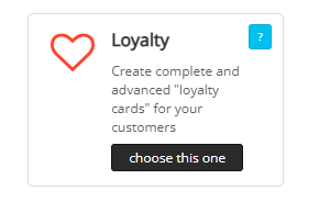
Loyalty Program There are quite a number of widgets that are not considered standard for most traditional website editors. They are often left to third-party developers and can sometimes be amazing, or, depending on the developer a less quality rendering of the feature. When considering the benefits of MobileFirst-Personal Websites, you should be quite clear that the more than 40 widgets are top quality and consistently work together on ways that make them even more powerful than when implemented separately. This issue' highlight is the loyalty program. It is often a costly extra for other sites that are not interested in consistency but squeezing as much money on a monthly basis as possible from the webmaster. The loyalty program can often go for hundreds of dollars a month, and to be honest is worth its weight in gold for those larger corporations who want to offer an enticement to come back to their stores and sites as often as possible. We all know the apps that give points and credit for each and every item purchased, a digital rendering of the punch card many of us carry in our wallets of stores where their services are valuable to us. We want to save money after purchasing them over and over, car washes, large food chains, pharmacies and so many others offer enticements to return and save by their loyal purchase of multiple products over time. The problem is that many are quite expensive to implement and configure. Like the rest of MobileFirst-Personal, the loyalty widget is simple to implement, requires no coding and is completely compatible with the entire system. There is no worry that, when implemented, future upgrades of the base platform could make the entire exercise useless as the widget and the platform are always improved simultaneously, meaning there is transparent operation at all times. |
 |
Questions or Comments? |
Contact us directly at MobileFirstPersonal@gmail.com |
Subscribe to the MobileFirst-Personal Newsletter |
Visit our LinkedIn Page: |
Visit our Facebook Page |
Visit our Instagram Page |
Visit our YouTube Channel |
Access Our Past Issues Archive |
💡 Answer to Trivia Question: Three key elements that make a website mobile-friendly are responsive design, fast loading times, and easy navigation. |