MobileFirst-Personal Websites
Archives
MobileFirst-Personal Websites Newsl;etter - December 24, 2024

Subscribe
MobileFirst-Personal Websites
Archives
MobileFirst-Personal Websites Newsl;etter - December 24, 2024
Steve Pond
Dec 24, 2024
2024 - Dec - 24 |
 |
New Website Possibilities, Structures and Strategies
Greetings, fellow website enthusiasts!
Brace yourselves, because we're about to embark on an exciting journey into the future of website creation! Over the past few decades, we've witnessed the incredible evolution of computing, from the mammoth mainframe computers of the 60s to the ubiquitous smartphones of today. And now, we're on the cusp of another paradigm shift – the rise of the mobile-first website.
You see, the small screen of the smartphone has become the dominant way people access the internet. No longer are the fancy graphics and bells and whistles the top priority. It's all about creating a seamless, optimized experience for the mobile user. And that's where MobileFirst-Personal Websites comes in.
We're here to help you navigate this brave new world of mobile-first design. Our Digital Business Card (DBC) is more than just a digital business card – it's a fully-functional website that puts the power of the internet in the palm of your hand. Imagine having your own personal digital space, where you can showcase your services, sell your products, or share your passions with the world.
But wait, there's more! With MobileFirst-Personal Websites, you don't need to be a coding wizard to create your dream website. Our user-friendly platform is as easy to use as Word or Excel. Whether you're an individual, a solopreneur, or someone with a side hustle, you can now have a website that's tailored to your needs, without breaking the bank. Imagine the possibilities – a website dedicated to your personal passion or hobby, an e-commerce store showcasing your handmade crafts, or a platform for sharing your professional expertise. The sky's the limit when you have your own personal website, and MobileFirst-Personal Websites is here to make that dream a reality.
So, let's embrace the mobile-first future and empower everyone to have a piece of the digital highway. Join us as we revolutionize the way we think about websites and personal online presence. The future is mobile, and it's waiting for you!
Sincerely,
Steve Pond |
 |
Harnessing the most powerful Mobile First Platform to Your Phone |
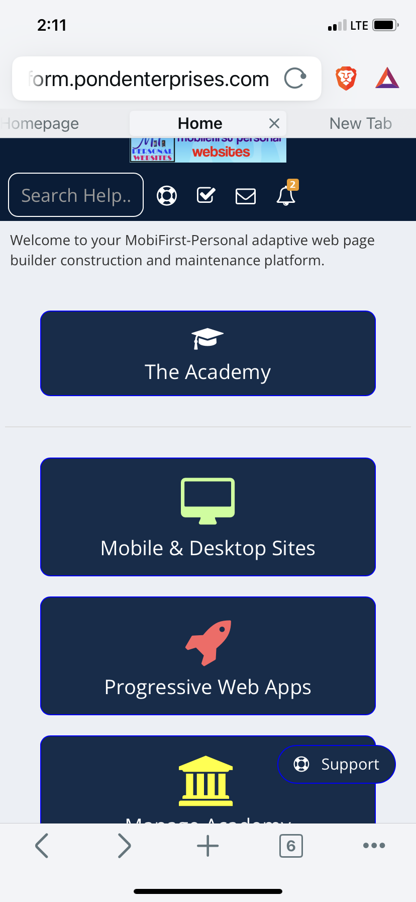
The MobileFirst-Personal Platform is probably the most complete and powerful website construction system ever offered to web developers. But what's truly remarkable is that it's also one of the simplest platforms to learn and use, even for those of us who can't code our way out of a paper bag.
As someone who has never been a fan of overly complicated, graphics-heavy websites, I've always preferred clean, efficient sites that get the job done. With the rise of mobile-first technology and the increasing importance of mobile-friendly websites, this approach has become more relevant than ever.
The restrictions imposed by the tiny smartphone screen are a game-changer. Many of the tricks and hacks used to create visually stunning websites on larger displays simply don't translate well to the mobile experience. Instead, the focus shifts to pure efficiency and tailoring the site to the needs of the user's fingers and hands.
This is where the MobileFirst-Personal Platform shines. Unlike traditional website builders that rely on pre-designed templates, this platform gives you the freedom to create your site from scratch. No more dealing with convoluted code or undocumented styles that become a nuisance after launch.
One of the best features is the "Options/Style/Colors and Fonts" menu, where you can easily control the overall look and feel of your website. But don't be fooled – the platform also offers full CSS capabilities, allowing you to fine-tune your site's styling to perfection.
In my experience, I've found that the simpler you keep your site, the better. The more elaborate the design, the more complex the instructions for the browser, and the slower the page loading times. By focusing on clean, mobile-optimized layouts, you can ensure a seamless user experience, no matter the device.
And the best part? The MobileFirst-Personal Platform is incredibly stable and difficult to break. I've spent countless hours experimenting with the editor, and I've yet to find a way to truly compromise its integrity. It's a testament to the platform's robust architecture and the team's dedication to making website creation accessible to everyone.
Now, I do want to address one potential issue – the challenge of translating mobile-first designs to larger desktop displays. The MobileFirst-Personal Platform has built-in solutions to address this, with separate controls and adjustments for the mobile and desktop versions of your site. This ensures that you can synchronize and fine-tune both experiences as you build, minimizing the risk of unsightly white spaces or stretched layouts.
My advice? Start building your mobile sites from scratch, using the platform's intuitive tools to capture your unique vision. Regularly check how your site looks on a desktop, perhaps even using a second monitor to streamline the process. And if you're struggling with the desktop layout, consider using a pre-built template – but always preview it on a desktop before committing.
The future is mobile, and the MobileFirst-Personal Platform is here to help you harness the power of the small screen. Embrace the simplicity, efficiency, and versatility of this remarkable platform, and unleash your creativity on the digital world. |
Combining Website styles into a coherent unity
The beauty of the MobileFirst-Personal Websites platform is its ability to create just about any website style you can imagine. While the template library offers a great starting point, I personally prefer to build my sites from scratch.
The only template I tend to use is the BizCard template. It's a unique and tremendously helpful starting point, allowing you to establish a strong digital presence without getting bogged down in complex CSS scripts. From there, you can customize the look and feel to your heart's content, maintaining a clean, cohesive design.
For the individual or solopreneur, this BizCard template and its connected widget are likely all you'll need. In most cases, the Digital Business Card (DBC) becomes the flagship of your online presence. And with the platform's intuitive page-building capabilities, you can easily manipulate the foundation widget to perform all the tasks you require.
The true power of this platform lies in its page-builder functionality. The widgets are the powerhouse, seamlessly integrating the essential features you need without the hassle of programming or complex development steps. And the best part? Each page you create automatically becomes part of the navigation structure, with the page name appearing in the top menu bar. If you want to hide a page from the menu, you can do so with a simple toggle in the page options.
But the versatility of MobileFirst-Personal Websites doesn't stop there. As a user, you may require a variety of web page types – from the core DBC to a portfolio showcasing your work, or even a full-fledged e-commerce store. The platform is more than up to the task, offering the ability to create complex, feature-rich websites that rival dedicated platforms.
And let's not forget the Academy module, which allows you to build professional-grade courses and training programs right within the platform. No need to juggle multiple systems or learn new construction techniques – it's all seamlessly integrated into a single, powerful solution.
With MobileFirst-Personal Websites, you can truly create a comprehensive digital ecosystem that caters to all your needs. From social connections and business essentials to sales and educational offerings, the platform empowers you to build a website that does it all. And the best part? The highest-tier plan, which unlocks all these capabilities, is just $30 per month.
The only limitations you'll face are the boundaries of your own imagination. So, dive in and start exploring the endless possibilities of this remarkable platform. The future of your digital presence is in your hands. |
Q/A Questions |
Q: What are the benefits of designing a website with a mobile-first approach? A: A mobile-first approach ensures that the website is optimized for smaller screens, faster load times, and better user experience on mobile devices. It also helps improve search engine rankings as Google prioritizes mobile-friendly websites.
Q: How can I make sure my website is mobile-first optimized? A: To ensure your website is mobile-first optimized, focus on adaptive design, prioritize content that is important for mobile users, optimize images and videos for mobile viewing, and test the website on different devices to ensure a seamless experience.
Q: What are some common mistakes to avoid when designing a mobile-first website? A: Some common mistakes to avoid include using large images and heavy animations that slow down loading times, neglecting to test the website on different devices, and not optimizing the website for touch interactions. It's also important to avoid using pop-ups and interstitials that can be disruptive on mobile devices. |
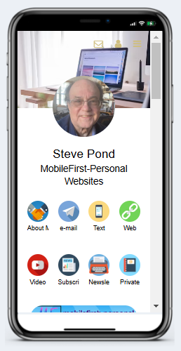 |
Steve Pond's Professional Digital Business Card |
 |
Unleashing the Power of Adaptive Editing |
What's even more amazing about the MobileFirst-Personal Websites platform is that any website you create using the simple user interface can be edited anywhere, anytime. This isn't your typical website builder that's confined to the desktop – the MobileFirst-Personal editor adapts to the device you're using, just like the websites it creates.
Simply open the editor from a browser, preferably Chrome, on the device you want to use, and the editor will seamlessly adjust to the screen size. This means you can perform powerful editing tasks wherever you are in the world, whether you're on your laptop, tablet, or even your smartphone.
Traditional website builders have often been limited to larger resolution devices, making on-the-go editing a frustrating experience. But with MobileFirst-Personal Websites, the flexibility is unparalleled. You can fine-tune your site, add new pages, tweak the styling – all from the palm of your hand.
This adaptive editing capability is a game-changer, especially for those of us who are always on the move. No more being tied to a desktop or laptop to maintain and update our online presence. The MobileFirst-Personal editor puts the power of website creation right in your pocket, allowing you to optimize and refine your digital space whenever inspiration strikes.
Whether you're waiting in line, sitting in a cafe, or commuting on the train, you can seamlessly access your website's backend and make the changes you need. It's a level of convenience and flexibility that simply wasn't possible with previous website builders.
So, not only does the MobileFirst-Personal platform create mobile-first websites that look and perform beautifully on small screens, but it also empowers you to edit and maintain those sites from the same devices. It's a truly holistic approach to modern web design, putting the control firmly in the hands of the user.
Embrace the power of adaptive editing and unlock the full potential of your online presence. With MobileFirst-Personal Websites, the boundaries of website creation have been shattered, allowing you to build, manage, and update your digital space with unparalleled ease and efficiency.
|
 |
Quote Of The Day |
"Design is not just what it looks like and feels like. Design is how it works." - Steve Jobs |
The Power of Page Building
The MobileFirst-Personal Editor creates websites by building individual pages that are discrete and independent of each other. This approach is a stark contrast to the intertwined, cross-page dependencies common in traditional website builders. By treating each page as a standalone entity, the platform can load specific chunks of information as they are required, without the need to include a lot of off-page data.
This page-by-page methodology has its roots in the early days of desktop publishing software. In the mid-1980s, I started with a program called Aldus PageMaker, which was soon acquired by Adobe and became a standard for printed page layout from the desktop computer. PageMaker treated each page as a discrete entity, allowing users to arrange content elements on the page with precision – a perfect fit for the newly emerging laser printer technology.
It was from this foundation that I approached the early iterations of HTML (HyperText Markup Language), the language that powers the web. HTML 1.0 also created browser-publishable, unique pages that were accessible through a navigation system, usually text links that moved the user to a new page when activated. In those early days, HTML was relatively straightforward to build and use, as each page was a self-contained unit, linked to others.
As the web evolved, new HTML editors emerged, offering WYSIWYG (What You See Is What You Get) formatting capabilities to make page creation more accessible. However, as HTML versions 2.0 and 3.0 introduced more advanced formatting and controls, the need for CSS (Cascading Style Sheets) arose, adding an overriding "style sheet" to manage the behavior of the code.
Around this time, I found myself a bit lost in the increasingly complex world of web development, until about three years ago when the platform that has become MobileFirst-Personal was introduced. Traditional editors often output convoluted code in an effort to match the various criteria specified in the editors, resulting in bloated and unruly outputs.
But the advent of the mobile phone and its small screen, coupled with the unwavering demand for fast-loading information, necessitated a return to simpler times – a return to the discrete page-based approach that I had experienced in the early days of desktop publishing and web design.
The MobileFirst-Personal Editor reflects this back-to-basics philosophy, with each page displayed as a rectangular strip across the main body of the interface. The Page menu item shows each page in the site as a white rectangular strip, with the hierarchy of the pages clearly visible – top-level menu items to the left, and sub-menus indented to the right, easily rearranged by dragging and dropping.
This page-by-page structure is read by the site from top to bottom, with the home page always at the top left position, and lower pages appearing in order from left to right on the top navigation bar. The editor is essentially creating elegant, standalone blocks of HTML code, allowing you to focus on the structure and organization of your website, without needing to delve into the underlying code. |
One of the most commonly used and versatile widgets in the MobileFirst-Personal editor is the Lists widget. This powerful tool allows you to display a wide variety of content in a structured, list-based format.
The beauty of the Lists widget is its adaptability. You can incorporate just about anything into these list items – videos, images, product listings, service descriptions, and so much more. The possibilities are truly endless, limited only by your imagination and specific requirements.
Using the Lists widget, you can create visually appealing and highly organized presentations of your content. Whether you're showcasing your portfolio, displaying your product catalog, or providing information about your services, the Lists widget offers a clean and intuitive way to present your material.
But the versatility of this widget doesn't stop there. Lists can be used in a variety of page structures and configurations within the MobileFirst-Personal editor. You can incorporate them as standalone elements or nesting them under other widgets to achieve unique display layouts and information hierarchies.
For example, you might use a List widget to showcase your product offerings, with each list item containing an image, a product description, and a call-to-action button. However, you could also embed that same List widget within a larger section, perhaps alongside additional content or complementary widgets, to create a more comprehensive and visually engaging presentation.
The Lists widget truly shines in its ability to help you organize and present information in a clean, user-friendly manner. Whether you're building a portfolio, an e-commerce store, or a resource-rich informational website, this versatile tool can be a game-changer in terms of how you structure and display your content.
One of the key advantages of the Lists widget is its adaptability to various screen sizes and devices. As a mobile-first platform, MobileFirst-Personal ensures that your lists will look and function seamlessly on both desktop and mobile devices, providing an optimal user experience no matter how your audience chooses to access your website.
So, as you explore the vast capabilities of the MobileFirst-Personal editor, be sure to take full advantage of the Lists widget. Experiment with different configurations, content types, and nesting strategies to create dynamic, visually appealing, and highly functional sections within your website. The versatility of this tool knows no bounds, empowering you to present your information in the most engaging and effective way possible. |
 |
Interesting Facts |
|
https://app.letterman.ai/s/mobilefirst-personal |
 |
This plan offers the ability to create up to 2 websites of 2 pages and includes the BizcCard Template and Widget to allow you to build two separate Digital Business Cards. These professional grade Business Cards can be used for a variety of businesses and can be the initial step in claiming a powerful digital presence on the Internet highway.
|