MobileFirst-Personal Websites
Archives
MobileFirst-Personal Newsletter - Nov 12, 2024

Subscribe
MobileFirst-Personal Websites
Archives
MobileFirst-Personal Newsletter - Nov 12, 2024
Steve Pond
Nov 12, 2024
2024 - Nov - 12 |
From the Founder's Desk |
Welcome to the second issue of the MobileFirst-Personal Websites weekly newsletter. It has been a hectic week, as I make decisions on what articles are going to feature in this newsletter as time goes by. I am convinced that the MobileFirst-Personal platform is the very best in the world for the purpose I have in mind. Simply put, I want to put the internet and the digital assets it offers back into the hands of the public at large. Most people have been squeezed out by the high expenses digital real estate required with traditional website development platforms.
The cost of high powered designers, the expense of using developers to properly code the designs and the even greater cost of maintenance as the versions of WordPress endlessly upgraded. Each upgrade demands that all the added, often costly , plug-ins be upgraded as well. And, more often than not, one of them isn't compatible with the upgrade or some of the other pieces that are assembled.
I will be honest with you, I am red/green colour deficient, and in many cases all that high powered design goes right over my head. Yes, color choices matter, and the way that the pieces have to be fit together like a jigsaw make creating a stunning website an expensive proposition.
But I think that the general public is getting to the point where they are tired of being manipulated by all the high powered algorithms designed to sell you wherever you want to go. I remember when there were people who took pride in having effective websites for the purpose they wanted them, whether or not they were pretty, conformed to the actual goals of graphic designers or the standards of fortune 500 company websites with no limit to expense.
I have looked for 30 years for a way to go back to the original intent of the internet creators, where ordinary people without much technical experience or savvy could provide a resource for the general internet community - without having to wade through massive amounts of marketing junk, making it appear that you are getting free services while the big boys are studying each move to see how they can add more to their bottom line.
I have a creation platform that is designed to give the avid hobbyist, the solopreneur, the independent sales person a way to get their message out to the world. Free of the social media conspiracy to control the things you want, and even desire, by manipulating the feed you are allowed to view by their algorithm. You only now can see the things they want you to see.
My platform is not free, but it is at the lowest end of the cost spectrum. I made it that way on purpose, to provide each and every one of you with the chance to have an internet presence of your own without breaking the bank, or even having to pick up a hammer to do it. You are free to evaluate what you feel you need, and find the suitable plan that allows you freedom from megacorporation oversight to offer the rest of the world your unique talents and enthusiasm for what you feel is important.
By no means do I think we can eliminate the power of the big social media conglomerates, but you now have the ability to share what is important to you among the people you deem important, independently of the algorithms that have begin to shape our daily life in whatever direction social media conglomerates deem to be the best in their interests, not yours! |
For Beginners and Novices Part 2 |
Essential Elements of a Mobile-First Interface
Creating a mobile-first personal website requires more than a simple translation of your desktop site to a smaller screen. It requires designing with mobile users' needs and limitations in mind from the outset. Here are the three essential elements of a mobile-first interface.
Adaptive Design and Fluid Layout
The backbone of any mobile-first interface is an adaptive design and fluid layout. An adaptive design ensures that your website adapts to different screen sizes and resolutions. It means that your site will look and function well whether it's viewed on a smartphone, tablet, or desktop.
A fluid layout, on the other hand, refers to the use of relative units like percentages, rather than fixed units like pixels, for widths and heights. This ensures that your website elements resize smoothly as the viewport changes, providing a consistent experience across various devices.
Incorporating both these elements will ensure that your site not only looks good on all devices, but also provides a seamless user experience.
Optimized Content Structure and Hierarchy
Given the limited real estate on mobile screens, it's crucial to optimize the structure and hierarchy of your content.
An optimized content structure means prioritizing the most important information and features and making them easily accessible. This could mean simplifying your navigation menu, breaking down long-form content into manageable chunks, or ensuring that your call-to-action buttons are prominently displayed.
Similarly, a well-thought-out content hierarchy helps guide users through your site. It helps them understand where they are, where they can go next, and how they can get back to where they started.
Intuitive Navigation and User Interactions
Finally, a mobile-first interface must have intuitive navigation and user interactions. Navigation refers to how users move around your website. A good mobile navigation system should be simple and straightforward, allowing users to reach their destination in as few taps as possible.
User interactions, on the other hand, are about how users interact with your site's features and functions. For mobile users, this often means touch interactions like swiping, pinching, or tapping. Make sure these interactions are smooth and intuitive, and avoid interfaces that require precise taps or complicated gestures.
In conclusion, a solid mobile-first interface hinges on a responsive design and fluid layout, an optimized content structure and hierarchy, and intuitive navigation and user interactions. Mastering these elements will set you on the path to creating a mobile-first personal website that delivers a superior user experience. Stay tuned for our next articles where we delve deeper into other techniques for mobile-first design. |
Tip of The Day |
Make sure to prioritize important content and calls to action on your mobile website, as users are typically looking for quick and easy access to information on their mobile devices. |
Understanding the MobileFirst-Personal Interface - Part 2 |
Optimizing Performance and Accessibility for a Mobile-First Personal Website
As you continue to refine your mobile-first personal website, two factors become increasingly critical: performance and accessibility. A well-performing site ensures a smooth user experience, while accessibility ensures that all users, regardless of their abilities, can easily navigate and use your site. Here’s how you can optimize these two crucial elements.
Compressing and Optimizing Media Assets
Large, unoptimized media files can significantly slow down your website, leading to longer load times and a frustrating user experience. Compressing and optimizing your images, videos, and other media assets can help reduce your site's load time and enhance overall performance.
You should aim to use the smallest file size possible without compromising on quality. There are various online tools and software that can help you compress and optimize your media files. Remember, faster load times improve user experience and can also positively impact your site's SEO ranking.
Implementing Lazy Loading and Progressive Enhancement
Lazy loading is a technique where specific elements, typically images, are only loaded when they're needed, such as when they enter the viewport. This can significantly improve your site's initial loading speed and overall performance.
Progressive enhancement, on the other hand, is a design philosophy that stresses the importance of basic content and functionality. This means your site should work even on the most basic level, with enhancements added for more capable devices or browsers. This approach ensures that as many users as possible can access and use your site, regardless of their device or browser capabilities.
Ensuring WCAG Compliance and Accessibility
The Web Content Accessibility Guidelines (WCAG) are a series of guidelines designed to make web content more accessible to people with disabilities. Ensuring WCAG compliance means making sure that your website can be easily navigated and understood by all users, regardless of their abilities.
This can include providing alternative text for images, ensuring sufficient contrast between text and background colors, and making sure your site can be navigated using only a keyboard. Remember, a more accessible website is not just a more inclusive one; it can also lead to improved SEO and a larger potential audience.
In conclusion, optimizing performance and accessibility is crucial for a successful mobile-first personal website. By compressing and optimizing media assets, implementing lazy loading and progressive enhancement, and ensuring WCAG compliance, you can provide all users with a fast, accessible, and satisfying browsing experience. Stay tuned for more articles on advanced mobile-first design techniques. |
Q/A Questions |
Q: What are the benefits of designing a website with a mobile-first approach? A: Mobile-first design ensures a better user experience for mobile users, improves site performance and loading speed on mobile devices, and boosts SEO rankings. 2. How can I ensure that my website is truly mobile-first Q: What are some best practices for optimizing a website for mobile users? A: Some best practices for optimizing a website for mobile users include using a simple and intuitive design, optimizing for touch navigation, ensuring fast loading times, prioritizing key content and CTAs, and testing the site on multiple devices and browsers. |
 |
For Advanced Developers Part 2 |
Integrating Progressive Web App Features into Your Mobile-First Personal Website
As you continue to enhance your mobile-first personal website, one development approach stands out for its ability to deliver a high-quality, app-like user experience: the Progressive Web App (PWA). Here, we explore the principles and benefits of PWAs, and how to implement PWA features into your personal website.
Understanding PWA Principles and Benefits
A Progressive Web App is a type of web application that utilizes the latest web technologies to provide a user experience akin to that of a native app. PWAs are responsive, meaning they adapt to any screen size, and they are also connectivity-independent, capable of working offline or on low-quality networks.
One of the main benefits of PWAs is their ability to be installed on a user's device, just like a native app. They also support push notifications, enabling real-time communication with users. Moreover, PWAs load quickly and are highly secure, offering an enhanced user experience that can lead to increased user engagement and retention.
Implementing PWA Features on Personal Websites
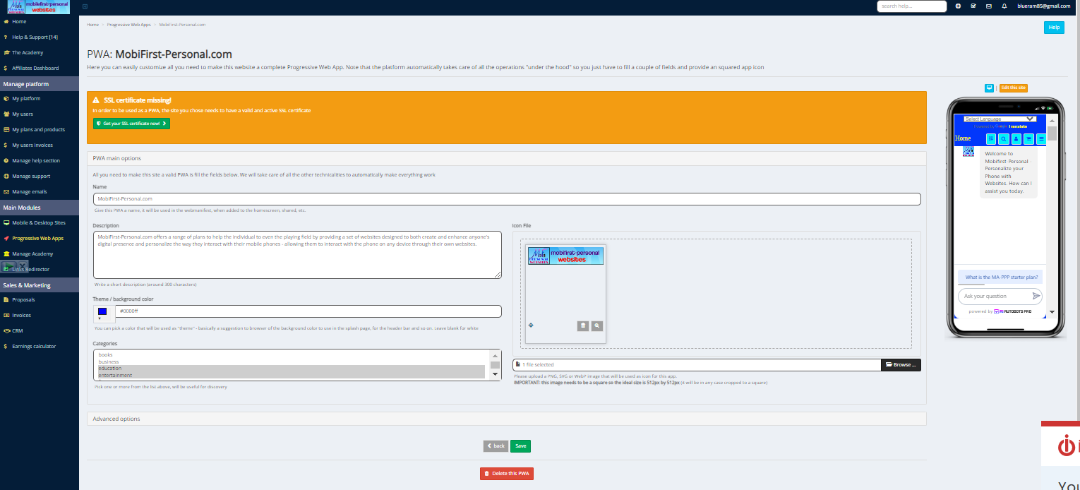
Implementing PWA features on your personal website involves several steps. This includes creating a web app manifest, which is a simple JSON file that tells the browser about your app and how it should behave when installed on the user's device.
You'll also need to implement a service worker, a script that your browser runs in the background, separate from a web page. This is what enables features like push notifications and background syncs.
You can start by adding essential PWA features, such as offline capability and push notifications, and gradually implement more advanced features as you go along.
Enhancing Offline Functionality and App-Like Experiences
One of the key features of PWAs is their ability to function offline or on low-quality networks. This is achieved through service workers, which can intercept network requests and deliver stored responses.
To enhance the offline functionality of your personal website, you should consider what content and features need to be accessible offline and cache them accordingly.
In terms of creating an app-like experience, the aim is to make your website feel like a native app. This can involve making the site full-screen, ensuring it responds quickly to user interactions, and even mimicking native app navigation patterns.
In conclusion, integrating PWA features into your mobile-first personal website can significantly enhance the user experience. By understanding and implementing PWA principles, enhancing offline functionality, and creating an app-like experience, you can deliver a website that's not just mobile-friendly, but also highly engaging and user-friendly. Stay tuned for future articles where we delve deeper into advanced techniques for mobile-first design. |
 |
Templates - An Introduction |
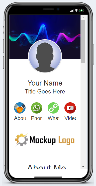
MobileFirst-Personal Websites includes a wide variety of templates that can be used to begin a website design easily and efficiently. They are designed exclusively for the platform requirements and are completely compatible witht the page editor. The free blank website offer does not include any of the templates since it is designed as a teaching site where a standard style Digital Busimess Card can be constructed from scratch. Durting that process many of the techniques and styles are built from the ground up to get you aquainted with how the editor works.
The influencer plan incldes all of the templates presently available. There are over two hundred template variations available in a wide variety of styles, colors and purposes, including many available to begion your own e-commerce store on a level not available as a sinlge integrated package before. The actual number of templates is determined by the plan that is purchased. The Connector plan has a single template, while the influencer plan offers all the templates presently available in the system.
All the paid plans include the BizCard template, giving a quick and professional Digital Business Card that anyone can build out to their satisfaction. The actual features that can be added to the site vary with the paid plan, but even the most elementary one can provide a powerful and compelling way to interest and intrigue potential clients with your products or services. |
 |
Widgets - An Introduction |
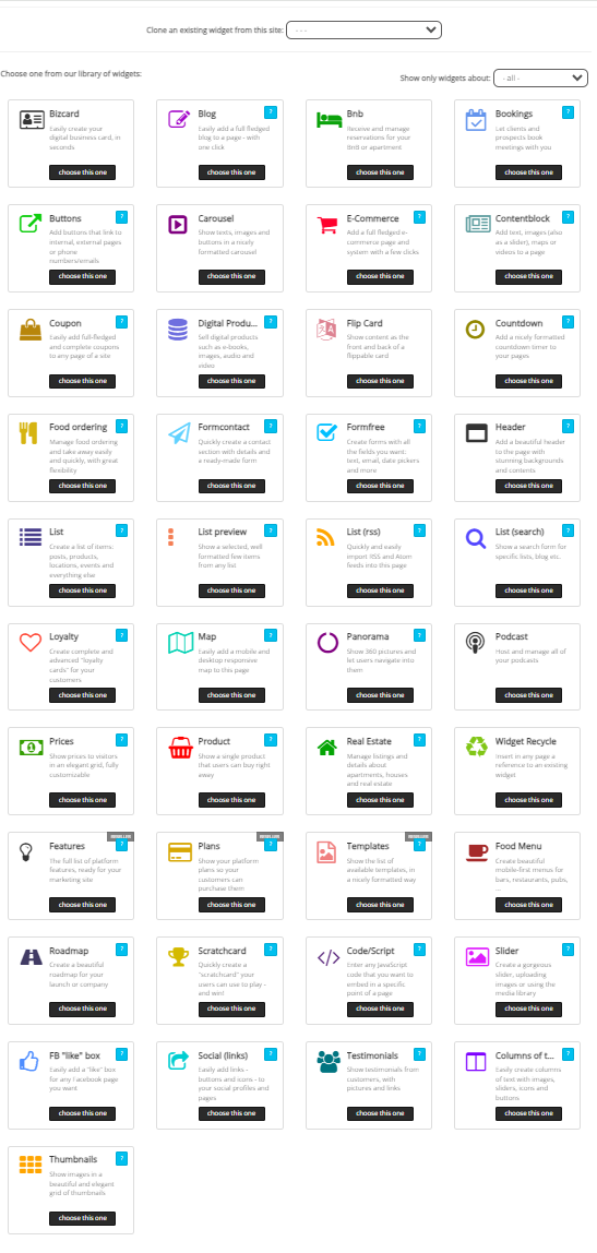
The heart and sould of the MobileFirst-Perosanl Websites platform editor are the integrated wiodgets. Unlike the more traditional web creation platforms, our mobile first editor relies on the integrated widgert for all of its substantial power. Other creator softwares allow all kinds of bits and pieces to be dropped into the site, depending on where the developer decides, and wherever he may source it.
The editor is a page builder, all of the parts and components are anchored on a page by page basis. Each page is an idependent web asset that integrates into the whole. The main way to desiogn and create a page is with the style ioptions and the widgets that are already avialable, there is no outside supplied widgets.
The fully delivers system offers over 40 widgets, plenty of power for almost every purpose a website can offer. In this section we wil begoing over each widget , one by one to provide a powerful over=view of the flexibilty and versatility of the integrated system. In ;poimnt of fact, there is no need for any outside development - offering total compatibilty, tested stability and undeniable interctivity of eash widget wit all of the others..
Next Week we wil take a look at the header widget, since it is often the first one that is required on any given page. |
 |
Sponsored By: |
MobileFirst-Personal Wbsites Personal Plan
|
 |
Build a Powerful Personal Digital Presence and Personalize the way you use your Phone!
5 Blank Sites - 10 Pages per site
Essential Templates and Widgets. Integrated AI and Handheld Page Editor lets you edit any of your sites from anywhere.
MobiFirst-Personal's Adaptive Site Plan for personalizing your smart phone by creating a synchronized web presence on all devices. The Personal Plan suggests the implementation of three discrete website types, a business V-Card and a personal V-Card. Each is entirely controlled, improved, and updated by the person who owns the system. The three other included sites are are suggested to be designed to provide a private website exclusivelty for site owner's use, a passion site and a sales site. |